
Sections
- Introduction
- Creating the Field Parameter
- Visualizing With the Field Parameter
- Changing the Settings of the Field Parameter
- Conclusion
Introduction
Often times we may need to create multiple charts for the same metric to show the breakdown by different fields. For example, 3 different bar charts for Quantity Sold broken by 3 different fields:
- Product
- Colour
- Sales Person
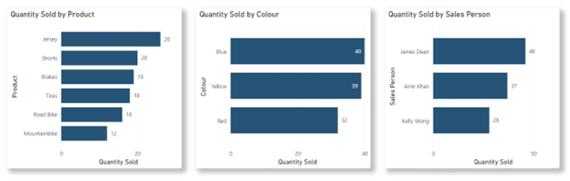
This, of course, will consume the limited area that we have in our report canvas. Why don’t we instead combine all these 3 bar charts into 1 visual and allow the audience to toggle between the different breakdown fields? This can be done with the Power BI feature called Field Parameters in Power BI Desktop.
Creating the Field Parameter
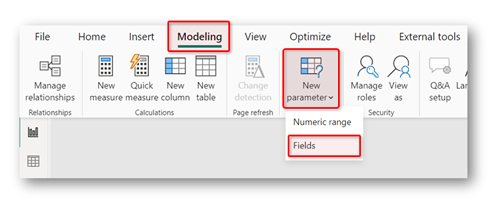
The first thing you need is to create the Field Parameters. In Power BI Desktop, in the ribbon, navigate to Modelling > New Parameter > Fields.
A configuration window will appear for you to customize your Field Parameter:
Name: This will be the name of the field parameter table
Fields: Fields/Columns that are available in your model that you can use as Field Parameters
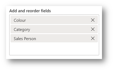
Add and reorder fields: Columns that you selected in the Fields will appear here
Add slicer to this page: This will automatically create a slicer in your report canvas based on the field parameters
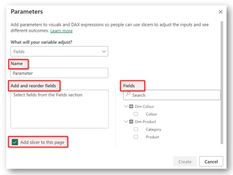
Once you selected the columns that you would like to use as the Field Parameters, it will appear in the Add and reorder field box. In this tutorial, the fields are Colour, Category and Sales Person.
Note that although you can choose any columns from any tables in your data model, whether it is from the fact or dimension table, for the purpose of this tutorial, use only columns that will not be aggregated.
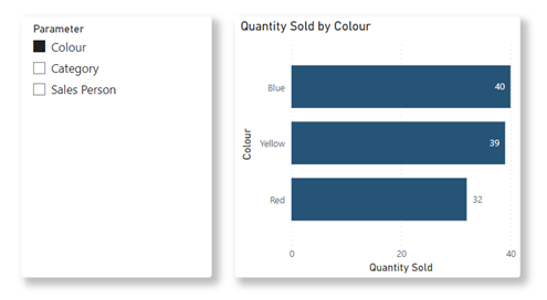
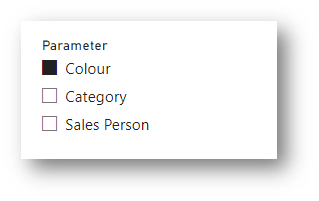
After you click Create, the first thing you may see on your report canvas is a slicer containing the fields you have selected.
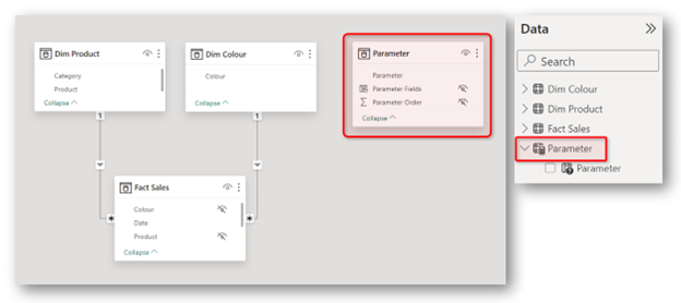
But if you review the data model, a table called Parameter has been added to your data model. This is a stand-alone table that will not have any relationship with any other tables in your data model.
Once this table is created, you can now proceed to using the field parameters in your visualizations.
Visualizing with the Field Parameter
Visualizing a Simple Bar Chart
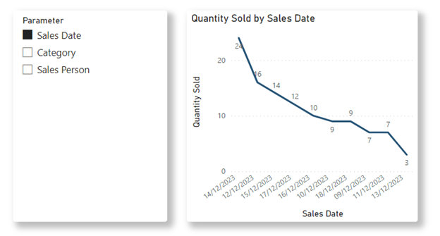
Let’s go back to report canvas with the slicer that contains a the field parameters. Now add a bar chart with the following configurations:
Y-axis : Column Parameter from the Parameter table
X-axis : Any measure you like to visualize ( in this tutorial we will use Quantity that is then renamed to Quantity Sold in the X-axis )
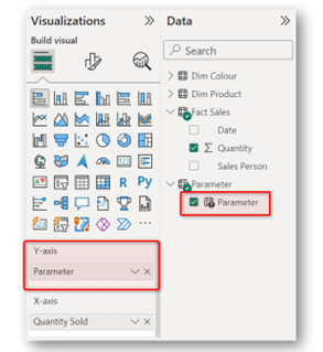
And just like that, you have created a bar chart with a dynamic field. Simply click on the slicer, and the breakdown is the bar chart will reflect the selection.
Visualizing a Column Chart With Small Multiples
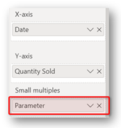
Now let’s create column chart with the following configurations:
X-axis : Date column
Y-axis : Quantity Sold
Small Multiples : Parameter
And your result will look like the following.
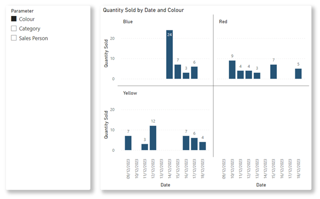
The Small Multiples breakdown will now reflect the selection in the slicer. Due to the nature for Small Multiples, you can also select multiple fields in the parameter to have a more specific breakdown of the metric.
Changing the settings of the Field Parameter
Changing an Existing Field
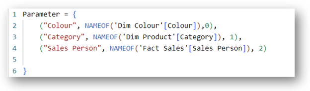
The Field Parameter settings pop up window will only appear the first time you create it. You will not be able to return to the settings window after. To make any adjustments, for example adding or changing existing field parameters, you will require to know a bit of DAX.
The field parameter table is basically a calculated table created using DAX. You can see the DAX syntax by clicking on the Parameter table.
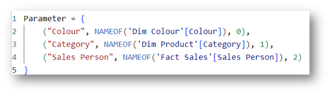
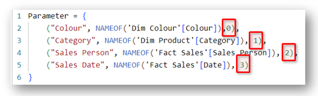
We can make changes to the field parameter just by adjusting the DAX syntax for the calculated table. For example, if we would like to replace Colour with Date, we can adjust the syntax to the following:
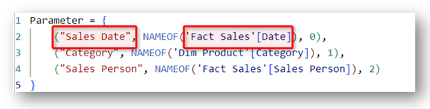
The red box on the left will be the name that will appear in the table, you can name this however you like. Whereas the red box on the right, you will need to specify the column and table name you would like to use as the new field. Once the changes have been made, they will be reflected in the table view and the slicers in your report canvas.
Adding an Additional Field
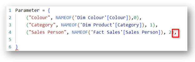
To add a new field, we first need to add a blank line in the syntax between line 4 and 5. Go to the end of line no 4 and hit Shift-Enter.
Then add a comma at the end of line 4.
Now it is time to add the new field. In this tutorial, we will add Date.
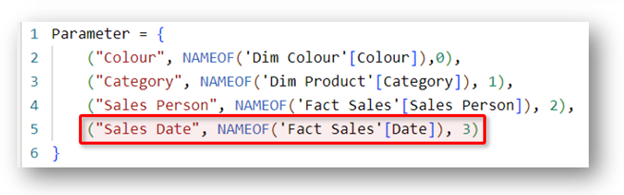
Please note that for the last field, you do not need to add a comma at the end of the line. And the number that appears at the end of every line is the sequence order for the fields in the slicer/visuals ie. Field with zero appears the top of the list, followed by 1 and 2 and so on. Make sure these numbers are unique.
Once you hit enter, the new field will appear in your report canvas.
Conclusion
Field Parameter is a great way to visualize different fields in the same visual and it can be used with the majority of the visuals available in Power BI desktop that has the following fields:
- X-axis
- Y-axis
- Columns
- Rows
- Legend
- Small Multiple
- Category
Based on your creativity, you can create very interactive visuals in your report to entice and improve users experience.
