
“People worry that computers will get too smart and take over the world, but the
― Pedro Domingos
real problem is that they’re too stupid and they’ve already taken over the world.”
Introduction
We all want to get the most out of our data and machine learning can come in handy by opening up new insights into your data. Most machine learning falls under a category called supervised learning, which is when the algorithm learns to link data with a target. Once the algorithm is trained, it can then be used to create predictions on new data. Unsupervised learning occurs when there is no target and the algorithm tries to group the data into a set of clusters.
Clustering your data can provide a new way to slice that is based on the properties of the data instead of other labels. For instance, customer data is often sliced by demographic parameters like gender, age, location, etc. This data can be useful in many cases, but what if you could slice your customers by their behaviour? What they buy, how often, how much they spend, etc. This information can help with advertising because you are now looking at past behaviour that can correlate better with future actions than demographics.
In this blog, we will explore the clustering functionality available in Power BI’s Scatter Chart and Table visuals. These visuals provide simple and powerful ways to cluster your data and allow you to get more out of it.
Sections
- Introduction
- Datasets
- k-Means Clustering
- Scatter Plot Clustering
- Multi-Dimensional Clustering
- Best Practices
- Conclusion
Datasets
For this blog, I am using several datasets generated in the python script shown below.
import numpy as np
import pandas as pd
from sklearn import datasets

np.random.seed(0)
n_samples = 1500

# Simple datasets
noisy_circles = pd.DataFrame(datasets.make_circles(n_samples=n_samples, factor=0.5, noise=0.05)[0], columns=['X','Y'])
noisy_moons = pd.DataFrame(datasets.make_moons(n_samples=n_samples, noise=0.05)[0], columns=['X','Y'])
blobs = pd.DataFrame(datasets.make_blobs(n_samples=n_samples, random_state=8, centers=3)[0], columns=['X','Y'])
no_structure = pd.DataFrame(np.random.rand(n_samples, 2), columns=['X','Y'])
blobs_4d = pd.DataFrame(datasets.make_blobs(n_samples=n_samples, random_state=8, centers=5, n_features=4)[0], columns=['W','X','Y','Z'])

# Anisotropicly distributed data
random_state = 170
X, y = datasets.make_blobs(n_samples=n_samples, random_state=random_state)
transformation = [[0.6, -0.6], [-0.4, 0.8]]
X_aniso = np.dot(X, transformation)
aniso = pd.DataFrame((X_aniso, y)[0], columns=['X','Y'])

# blobs with varied variances
varied = pd.DataFrame(datasets.make_blobs(
        n_samples=n_samples, cluster_std=[1.0, 2.5, 0.5], random_state=random_state
        )[0], columns=['X','Y'])
This code came from the scikit-learn cluster comparison example. The example generates several datasets with various characteristics and runs several different clustering algorithms on them. The original script generates a nice visual showing the results and the strengths and weaknesses of each algorithm.
I ran the code as a python data source within Power BI and then added an index column in Power Query for each dataset.
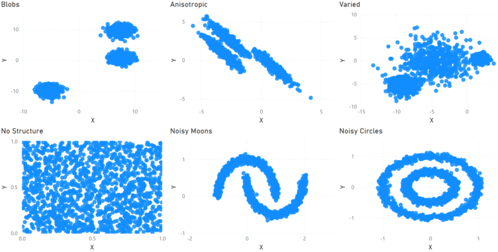
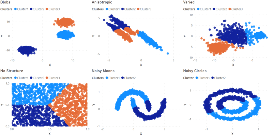
Below are scatter charts of the main datasets I am using in this blog. The datasets across the top all have three clusters but with different forms: well-defined blobs, stretched in one direction (anisotropic), and variable sizes. The bottom row has an example of data with no clusters and two with well-defined but intermingled clusters.
k-Mean Clustering
From the results of my testing, I believe the algorithm responsible for clustering in Power BI is the k-means algorithm. I did not find any confirmation on this, but it seems reasonable given the results found below. Knowing this can help you understand how Power BI finds clusters and how it will work in the situation you are using.
The goal of k-means is to minimize the distance between the points of each cluster. Each cluster has a centre. Data points are labeled as part of a cluster depending on which centre they are closest to.
As a result, certain types of clusters are easy to find, and in others, the algorithm will fail. Below, you will see examples of both cases.
If you want to go deeper, here is an article that goes in-depth on k-means.
Scatter Plot Clustering
To do a cluster analysis, create a Scatter Plot with your data. Make sure to include a column of the data in the ‘Details’ field of the visual because clustering will not be available if you do not. I used the index column I created for this.
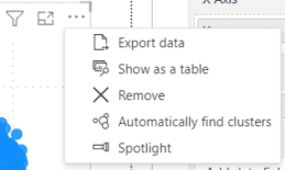
Then, I clicked on the ellipsis in the corner of the visual. A menu (shown below) appeared with the option to “Automatically find clusters.”
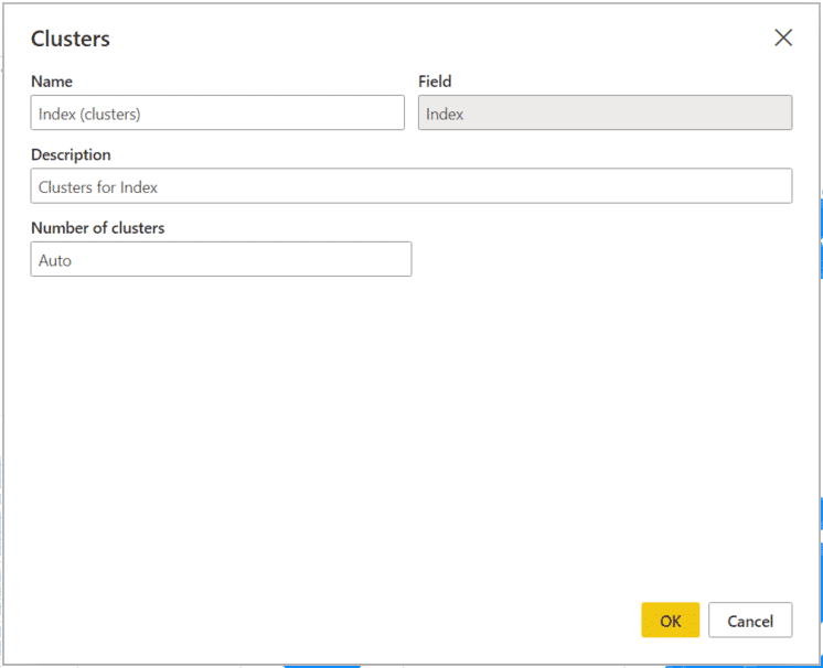
Clicking the option to find clusters brings up a form to set some values for the clustering. Finding clusters will create a new column in your data; the name of this new column is set in the ‘Name’ box. You can also create a description of your clustering and set the number of clusters.
By default, Power BI will try to determine the correct number of clusters, but if you know how many clusters your data has, you can then set a fixed value for this.
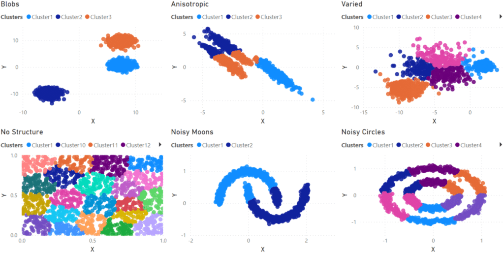
For my first pass at finding clusters in the data I allowed Power BI to determine the correct number of clusters for each dataset. From the results below, you can see Power BI gave mixed results. For the ‘Blobs’ data set, clustering worked very well. The k-means algorithm excels at these types of clusters, so this is not a surprise.
What is disappointing is how poorly it did on the other datasets. Several estimated too many clusters (“No Structure” had twenty-one clusters!!!) or had trouble sorting data points into the correct clusters (“Anisotropic” and “Noisy Moons”)
I then did a second test setting the number of clusters manually. Again, the “Blobs” dataset did well and the “Varied” dataset was passable, although Cluster 1 does push into some points which should be in Cluster 2.
The other clusters (“Anisotropic”, “Noisy Moons”, and “Noisy Circles”), although well defined are positioned in a way that is impossible for the algorithm to separate. As a result, even with the correct number of clusters being forced, the algorithm still does a poor job of sorting the data into the correct clusters.
Multi-Dimensional Clustering
So far, I have only shown clustering using the Scatter Chart, so all of the examples have been only two-dimensional. Power BI can cluster in more than two dimensions by using the Table visual.
For this example, I made a data set similar to the ‘Blobs’ one above, but with five clusters in four dimensions (W, X, Y, Z). I put all of the data in a table, and just like in a Scatter Chart, clicking the three dots in the corner brings up a menu with an option to find clusters. The process is the same as above. In this example, I forced the algorithm to find five clusters.
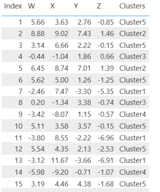
Above is the data in a table visual, with cluster assignments, and below are six Scatter Plots showing the clusters in all combinations of the four dimensions I used.
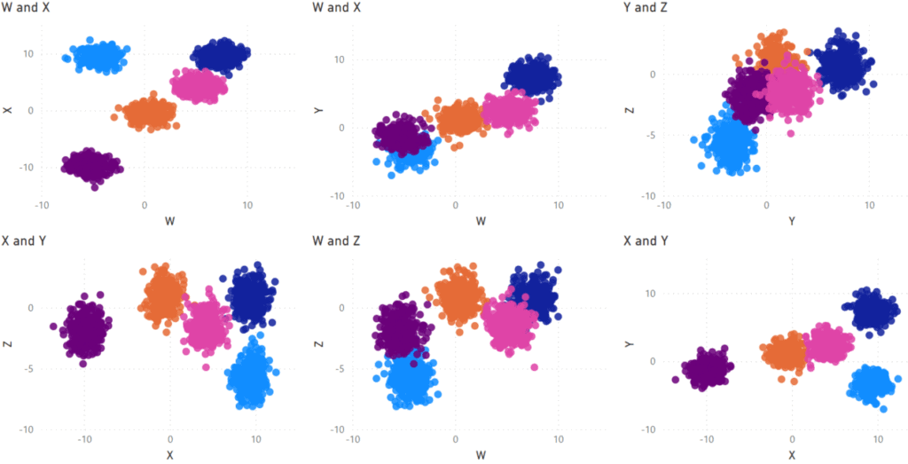
For this dataset, Power BI does a good job of separating out the clusters and shows that clustering can work in more than two dimensions.
Best Practices
Most datasets in practice are not as ideal as the ‘Blobs’ examples I used here and may contain various elements from the other datasets in this blog. Some datasets are very hard to split into clusters. As such, your experience with clustering will vary and may not work in all cases.
One limitation of clustering in Power BI is that the clusters don’t update on data refresh. Each row in the data retains the cluster designation from when the report developer did the clustering. New rows go into a blank cluster. For a report which will refresh often, you should only cluster on data where the cluster designations are not likely to change rapidly over time and plan to manually re-do the clustering at a regular interval. Right now, the only way to get around this would be to perform the clustering in an R or Python step in Power Query.
Power BI names the clusters “Cluster1”, “Cluster2”, and so on. If it is relevant to your data, you could assign more descriptive names to your clusters. The easiest way to do this would be to create a table by directly entering data into Power BI. The table would have two columns – one containing the default cluster names and a second with your descriptions. This new table is then linked to the table containing the clusters.
You may also have to take some time to prepare the data. Make sure to fill in or remove any data points with missing values. Scale the values appropriately so all the dimensions are in approximately the same range. For example, if one dimension has values under 100 and the other values in the thousands, divide the larger dimension by an appropriate value to scale them into the range of the others.
Conclusion
In this blog, I’ve tested out Power BI’s clustering ability on a variety of cluster types. The results were mixed in that the clustering worked well in some cases and failed in others. In a real-world scenario, clustering may be able to open up additional information from your data, but it does depend on your data.
