
The most disastrous thing that you can ever learn is your first programming language. ― Alan Kay
Why Bother with R and Python?
When I learned how to be a business intelligence analyst, I learned all about ETL, data warehousing, SQL databases, and then at the end Power BI, a product which promised to be able to do everything I had just learned in a single piece of software.
Power BI is impressive, having an elaborate ability to ingest data through Power Query, a data storage engine with the same code base as Microsoft’s Enterprise-grade Analysis Services, and a fancy set of visualizations for the front end.
So, if the base abilities are so great, why would you want, or need, to use programming languages like R and Python. Well, there are at least a few reasons.
There are times when you will need to do a more advanced analysis of your data beyond what Power BI can do.
Both R and Python are full programming languages with extensive capability for analyzing and manipulating data which can unlock more insights from your data.
While Power BI can connect to many data sources, there are a few that it lacks. R and Python are open source languages and as a result, have a plethora of packages and libraries which can be used to extend the language’s abilities.
Some of these packages include dealing with specific data sources and file types. They are also capable of some useful visuals.
Your organization may have existing solutions written in R or Python, and this code could easily be reused in Power BI. Or perhaps you are already an expert at R or Python.
Rather than learning the in and outs of Power Query, you could largely by-pass it with a language you are already familiar with and fast at.
Details, Details, Details
Before you can use R or Python in Power BI Desktop, you need to have the language, along with any packages you want to use, installed on your computer.
For R, the base installation is the minimum you need, but adding some extra packages, such as tidyverse, can help. For Python, you are required to install pandas and matplotlib at a minimum so that it can handle data frames and visuals.
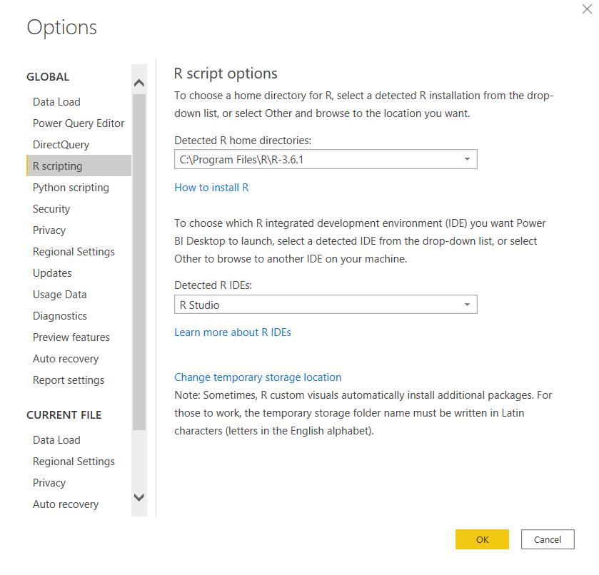
Using the options menu in Power BI, you can select which version of the languages you want to use (if you have multiple versions installed), as well as an external editor, which will come in handy later.
For R, I recommend RStudio and Visual Studio Code for Python (Sublime is also a good editor).
Most of R’s packages are on the smaller side and are meant for a single purpose. Python’s libraries are often large and cover many different functions, although, for performance purposes, it is possible to only import the parts of the package you need.
In Power BI Desktop, you are only limited by the packages installed on your computer, in the Power BI Service, you are limited to what has been installed there. Here is a list of the R packages available in the Power BI Service, and Python libraries available.
The Road Ahead
In this post, I am going to walk through an example that covers the places in Power BI you can use R and Python. This example will use R to scrape a Titanic passenger list from the web.
Then use Python to create a Machine Learning model to predict whether a passenger will survive or not, and analyze the effectiveness of the model.
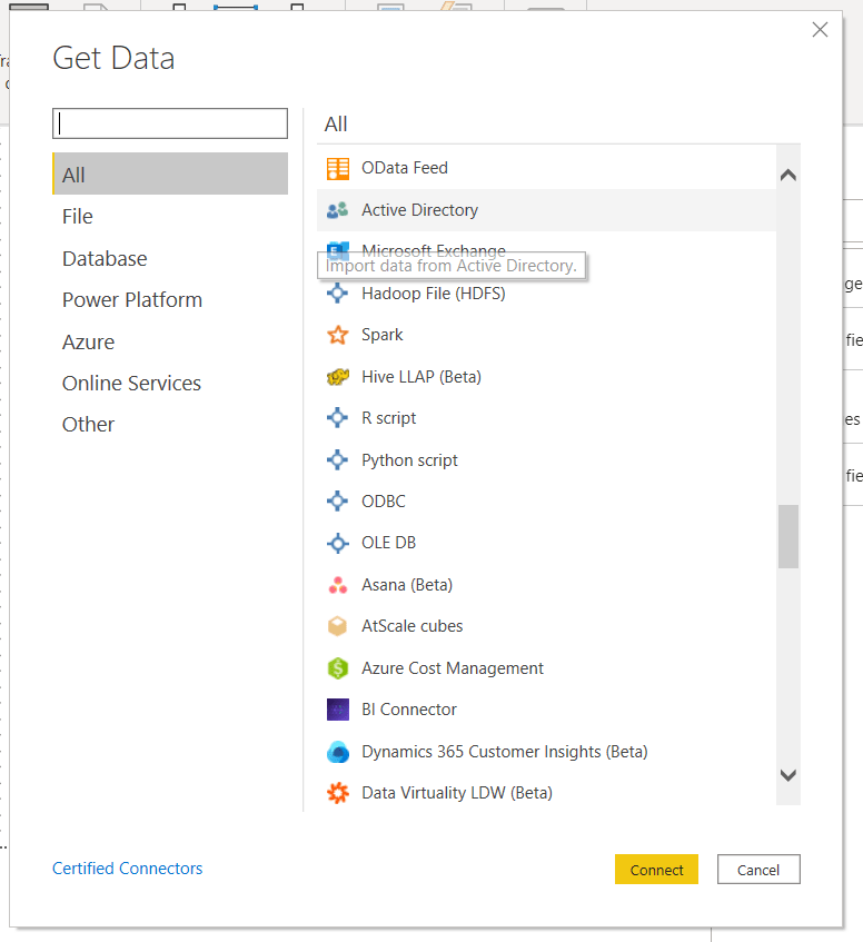
Get Data
The first place you can use these languages is to Get Data, where an R or Python script is listed under the “Other” category. Selecting this opens up a basic text editor where you can type or paste your script.
One of the only major limitations in what you can do here is that the script will time out after 30 minutes, so make sure whatever you are doing happens within that time.
The script I am running here scrapes a website for the passenger list from the Titanic and splits it into a training and a test set.
You may be asked to enable scripts at this point. Also, permissions for the data need to be set to public if you want to use the scripts in the Service.
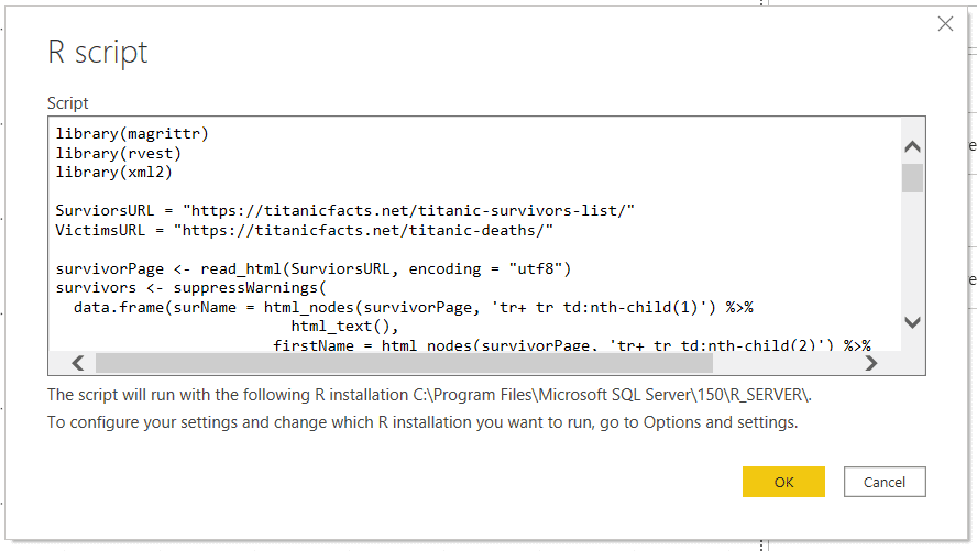
    library(magrittr)
    library(rvest)
    library(xml2)

    SurviorsURL = "https://titanicfacts.net/titanic-survivors-list/"
    VictimsURL = "https://titanicfacts.net/titanic-deaths/"

    #Survivors
    survivorPage <- read_html(SurviorsURL, encoding = "utf8")
    survivors <- suppressWarnings(
          data.frame(surName = html_nodes(survivorPage, 'tr+ tr td:nth-child(1)') %>%
                html_text(),
                firstName = html_nodes(survivorPage, 'tr+ tr td:nth-child(2)') %>%
                html_text(),
                age = html_nodes(survivorPage, 'tr+ tr td:nth-child(3)') %>% html_text() %>% as.numeric(),
                borded = html_nodes(survivorPage, 'tr+ tr td:nth-child(4)') %>% html_text(),
                roomClass = html_nodes(survivorPage, 'tr+ tr td:nth-child(5)') %>% html_text(),
                person = "man",
                survived = 1,
                stringsAsFactors = FALSE)
    )

    #Victims
    victimsPage <- read_html(VictimsURL)
    victims <- suppressWarnings(
          data.frame(surName = html_nodes(victimsPage, 'tr+ tr td:nth-child(1)') %>%
                html_text(),
                firstName = html_nodes(victimsPage, 'tr+ tr td:nth-child(2)') %>%
                html_text(),
                age = html_nodes(victimsPage, 'tr+ tr td:nth-child(3)') %>% html_text() %>% as.numeric(),
                borded = html_nodes(victimsPage, 'tr+ tr td:nth-child(4)') %>% html_text(),
                roomClass = html_nodes(victimsPage, 'tr+ tr td:nth-child(5)') %>% html_text(),
                person = "man",
                survived = 0,
                stringsAsFactors = FALSE)
    )

    #Extracting gender from name prefix
    passengers <- rbind(survivors, victims)
    passengers$person[grep("^Mrs", passengers$firstName)] <- "woman"
    passengers$person[grep("^Mme", passengers$firstName)] <- "woman"
    passengers$person[grep("^Senora", passengers$firstName)] <- "woman"
    passengers$person[grep("^Mlle", passengers$firstName)] <- "woman"
    passengers$person[grep("^Dona", passengers$firstName)] <- "woman"
    passengers$person[grep("^Ms", passengers$firstName)] <- "woman"
    passengers$person[grep("Lady$", passengers$firstName)] <- "woman"
    passengers$person[grep("^Miss", passengers$firstName)] <- "woman"
    #passengers$person[grep("^Master", passengers$firstName)] <- "boy"

    #Assigning passengers to a test or training set
    set.seed(1337)
    passengers$id <- 1:nrow(passengers)
    train <- passengers %>% dplyr::sample_frac(0.75)
    test <- dplyr::anti_join(passengers, train, by = 'id')
    train$inTrain <- 1
    test$inTrain <- 0
    passengers <- rbind(train, test)

    passengers$age[is.na(passengers$age)] <- 0
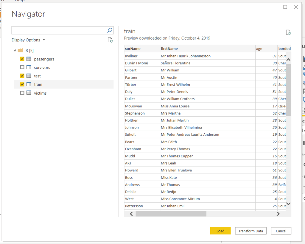
Once the script has run, Power BI searches the environment for any data frames and then presents you with a screen where you can choose which one(s) you want.
Transforming Data with R and Python
You can then add additional steps as you normally would in Power Query. Additional R and Python scripts are options as well.
Choosing these as applied step opens the editor again, with an initial command which loads the table as a data frame called “dataset”.
Below is some python code which is added as a second step after the R code collects the Titanic data. This code trains and tests a Random Forest machine learning model on the data.
from sklearn.ensemble import RandomForestClassifier

#Formatting data
dataset['bordedNum'] = pandas.Categorical(dataset['borded']).codes
dataset['roomClassNum'] = pandas.Categorical(dataset['roomClass']).codes
dataset['personNum'] = pandas.Categorical(dataset['person']).codes
dataset['prediction'] = 2

#Training the model
train = dataset.query('inTrain == 1')
rfc = RandomForestClassifier()
rfc.fit(train.loc[:, ['age', 'personNum', 'roomClassNum', 'bordedNum']], train.loc[:,'survived'])

#Testing the model
test = dataset.query('inTrain == 0')
pred = rfc.predict(test.loc[:, ['age', 'personNum', 'roomClassNum', 'bordedNum']])
test['prediction'] = pred

dataset = train.append(test)
One thing to keep in mind with script Applied Steps is the data size and free space on your hard drive.
Power BI will temporarily save copies of the data during the execution of the script steps to a temporary folder on your hard drive (The location of this folder can be changed in the options menu).
Putting all your transformations into one step can limit the amount of data deposited.
Visualize Data with R and Python
Once the data is loaded, we can then create visuals with R and Python. In the visuals panel, the icons for both an R and Python visuals. They work pretty much the same and here we will be using the Python visual.
Clicking the visual creates a blank visual on the canvas and brings up an editor at the bottom of the screen.
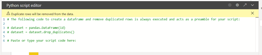
You will notice in the editor that there are a few lines of commented code which is automatically added. This code takes the data you added to the visual, puts it into a data frame, and then removes the duplicate rows.
If you do not want duplicate rows removed, make sure to add some sort of key column which will make each row unique.
Note, there is a limit of 150 thousand rows per visual and it needs to run in 5 min for in Power BI Desktop, and 1 min for the Service.
In the top bar, on the right side of the visual, there are several useful buttons. From left to right, they are a button to run the script and update the visual, open the options menu to select the script options you want, and the arrow opens an external editor.
Opening an external editor is made easy because as it opens the editor (such as Rstudio or VS Code), it exports the data set as a CSV file, and adds the necessary code to the editor to read in the CSV file.
You can then play around until you have a visual you like in the editor, and copy and paste the code back into Power BI.
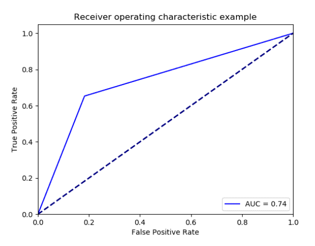
For the Titanic example, here is some code that will create a ROC curve visual, which will show us how well our model worked at predicting who lived and died on the Titanic.
from sklearn.metrics import roc_curve, auc

import scikitplot as skplt
import matplotlib.pyplot as plt

#Calculating statistics
fpr, tpr, threshold = roc_curve(dataset.loc[:, 'survived'], dataset.loc[:, 'prediction'])
roc_auc = auc(fpr, tpr)

#Creating visual
plt.figure()
lw = 2
plt.plot(fpr, tpr, 'b', label = 'AUC = %0.2f' % roc_auc)
plt.plot([0, 1], [0, 1], color='navy', lw=lw, linestyle='--')
plt.xlim([0.0, 1.0])
plt.ylim([0.0, 1.05])
plt.xlabel('False Positive Rate')
plt.ylabel('True Positive Rate')
plt.title('Receiver operating characteristic example')
plt.legend(loc="lower right")
plt.show()
Conclusion
In this post, I’ve covered how to use the R and Python languages in Power BI to get and transform data and create visualizations. I did this through an example of doing some machine learning using a Titanic data set to create a model that predicts which passenger lived or died.
