

Contents
- Iteration Insights Movement Challenge Dashboard
- Creating an Inclusive Fitness Challenge
- Creating an Analytics Dashboard with a Retro Video Game Style
- Encouraging Company Participation
- Iteration Insights Movement Challenge Updates
- About the Dashboard Creators
Iteration Insights Movement Challenge Dashboard
Welcome to the Iteration Insights Movement Challenge video game!
After pressing start, you will enter our home page showcasing the company’s progress towards our goal of 236 hours of movement. You will also find a map highlighting our route around Alberta and BC.
The dashboard shows Total Hours of movement, the conversion of those hours into Distance (km), and Total Sessions of movement from the company. The homepage shows the overview of our company data which is analyzed and updated over the time of the challenge.
You can check specific employee analytics by clicking Players at the bottom of the dashboard.
On the Players page, you can specify which employee you want to look at by finding their name within the slicer on the far left. From there, you can see the employee’s pixelated picture, current level, and some metrics similar to the home page but tailored to the selected employee.
The levels are calculated out as 3 hours per level. So, every 3 hours of movement that an employee contributes will earn them a heart/level on their page.
For more information on which employees currently have the “high scores,” click on Leaderboards at the bottom of the dashboard. This page shows a table ranking of all our employees based on Most Hours, plus pictures of the leaders in all our leaderboard categories: Most hours, Most Improved, Most Variety, and Most Consistent.
Creating an Inclusive Fitness Challenge
With remote work becoming our new routine last year, Iteration Insights wanted to create a company activity with a common goal and at-home completion. The company ran a five-week steps challenge where the goal was to “Walk to Nashville” as that was the location of the largest annual conference for the Microsoft Business Applications communities last year.
After the steps challenge, there was a lot of great feedback from employees about what worked and what could be improved, so we had a lot of information to work with this year when creating a new company challenge as we continue our remote work!
Designing this year’s challenge, we wanted to keep the components that employees specifically liked last year. These components included encouraging friendly competition, an incentive to get outdoors and get active, a shared group goal, and an analytics dashboard for tracking company progress.
Based on feedback, the things we wanted to add this year were more options for activities that would count towards the company goal, a shorter period for the challenge, no teams, and, of course, prizes. Everyone loves a good competition with prizes at the end.
Looking over the results from last year’s challenge, we also realized that the challenge favoured people who already had fitness routines worked into their schedules. With our new challenge this year, we wanted to make sure we were creating a space where more people would have the opportunity to “win.”
Going hand in hand with the feedback to include more activities, we also wanted to create a movement challenge that accounted for movement capabilities. All movement (assisted and unassisted) is good movement, and we want to embrace that here at Iteration Insights as we encourage employees to get active in any way they wish!
With these ideas and all our feedback in mind, we created the Iteration Insights Movement Challenge!
Iteration Insights Movement Challenge Outline
Company Goal
Collectively reach 236 hours of movement as a company of 17 employees.
Duration
Three weeks throughout June.
Route Used to Track Company Goal
We created a route based on landmarks surrounding Calgary, the home of the Iteration Insights office. We ensured the total amount of hours was a reasonable goal to achieve with 17 employees participating.
The Route
- Calgary to Royal Tyrell Museum | 28 hours of movement
- Royal Tyrell Museum to World Famous Gopher Museum | 18 hours of movement
- World Famous Gopher Museum to Rocky Mountain House | 30 hours of movement
- Rocky Mountain House to Yoho National Park | 82 hours of movement
- Yoho National Park to Lake Louise | 2 hours of movement
- Lake Louise to Banff National Park | 38 hours of movement
- Banff National Park to Cave and Basin National Historic Site | 0.5 hours of movement
- Cave and Basin National Historic Site to Bow Valley Provincial Park | 9.5 hours of movement
- Bow Valley Provincial Park to Calgary | 28 hours of movement
Measurement
One hour of movement from an employee equals one hour of movement towards our company goal. The company goal was calculated using the time to walk from one location to the next, but there are many types of movement we are including to get ourselves moving and grooving around Alberta and BC.
Tracking Movement
Each employee is tracking their movement activities using Strava. We chose this app because it can be used as a tracker on your phone for an activity like walks, biking, rolling in a wheelchair, and even rowing! Using Strava, employees can also manually enter activities which allows them to not have to rely on turning on the tracking in the app for each session.
Leaderboards
We have four leaderboards that we will be watching throughout the movement challenge. In the end, the top performance in each leaderboard category will win a prize!
Leaderboard Categories
We wanted to create categories that did not solely focus on top performance in terms of hours or skill level. The four categories we chose are:
- Most Hours | Based on total hours of movement
- Most Improved | Based on comparing total hours of movement in the first half of the challenge with the hours in the second half
- Most Variety | Based on the highest number of different activity sessions completed
- Most Consistent | Based on the most consistent time durations of activities throughout the challenge
Creating an Analytics Dashboard with a Retro Video Game Style
With the creation of the dashboard, we thought it would be a great opportunity for our practicum students Diana Arciniega and Eric Kolesar to get some hands-on experience working on a company project from start to finish. Here is what they had to say about their experience designing and implementing the Iteration Insights Movement Challenge Dashboard:
We are super excited to show off this dashboard we have put together!
As practicum students coming from the SAIT Business Intelligence program, we wanted to do something fun and different from projects we have previously worked on, and create something that matched the spirit of the Movement Challenge at Iteration Insights. It was nice that this was our first project for the company and that we could get so creative with the design.
Starting work with the company in May, we had both seen the Star Wars Trooper Dashboard on LinkedIn, created by Tutu Hamid. The dashboard was created for the unofficial Star Wars Day on May 4th, and seeing the dashboard design gave us permission to reach outside the box with our design and go far with the Movement Challenge dashboard.
Our focus when it came to the dashboard was on the visual elements. So, creating mockups and getting feedback was a critical step for us in getting an idea of what we wanted to design.
Some of the initial ideas for the dashboard came from the steps challenge that Iteration Insights created last year. We started without a theme, though, and mainly tried to develop something that would encompass all the KPIs we needed.
Over time, the dashboard evolved through a constant feedback cycle from both the analytics and business teams in the company. However, there were a couple of challenges that arose when working on the Movement Challenge dashboard.
The first challenge was a common problem with Power BI projects of getting the data.
Employees are tracking their data through Strava where posting a movement activity shows Date, Duration, Activity Type, Distance, and a map. We tried multiple methods to ingest this data, initially using an open API. However, we ran into problems with trying to get all the data we needed as it was missing some key elements such as the date of when the movement activities were done.
So, we tried other methods, and, with the help of our colleague John Llamzon, we found a Google Chrome extension where we could export the data from Strava into a CSV file that contained all the information we needed. Once we were able to get the data, it was simple to connect the CSV file through Power BI.
Another challenge was getting the visuals to match our retro video game theme, with the biggest hurdle being the map.
We searched through various custom visual maps trying to find ones that would allow us to have a route with multiple destinations along the way. We found a possible map that had some elements but did not have any background visuals to it.
Eventually, we decided it would be best to make our own map so we could match our theme as well as be able to show company progress in the challenge.
We created the map using Pixil Art to draw it out with pixels and overlay the image with numerous characters scattered around the map. The characters each have their measures with parameters that determine whether to display them or not. By doing this we can make it look like the character is moving around the map and it gives a fun visual element to the company progress.
Diana initially came up with the retro video game theme as our design concept having recently watched the TV show Halt and Catch Fire. We then played around with Mario-style ideas, looked at pixelated games like Minecraft, and researched the classic arcade games like Space Invaders and PacMan.
These games all contain similar elements like high scores, hearts for levels or lives, pixelated avatars, achievements, and trail maps. Organically, our ideas and research came together with what we were building, we developed our theme, and the concept matched perfectly with the idea of the company and individual progress that everyone wanted to be showcased in the dashboard.
We are both super proud of how the Movement Challenge dashboard came together as a whole. We put a good number of hours into going over all the details and collaborating on our ideas with the feedback we received.
The two parts we especially like are the pixelated pictures of the employees, which we created using Pixel Me, and the map portion of the dashboard. We think the report does a good job recreating that retro video game feel.
Connecting Strava to Power BI
One of our goals with the Movement Challenge Dashboard is to showcase both the cumulative analytics from the company and the individual analytics of employees. We wanted enough information to show meaningful data such that employees could check the dashboard regularly throughout the Movement Challenge and find useful updates and visualizations within the dashboard.
As mentioned above there were a few challenges. Unfortunately, we could not use the Strava club activities API for our dashboard due to limited information available. Specifically, we needed to be able to pull the date of every activity completed by employees.
Instead, we used this Google Chrome extension which summarizes Strava activities on a club’s Recent Activity tab.
The extension displays a widget that includes the Name, Date, Distance, Pace, Unit, Time, and Elevation. It then gives club members the ability to copy and paste the data to a spreadsheet or download the data in CSV format.
With this extension, we uploaded the CSV file on SharePoint and used it as the data source for our Power BI dashboard.
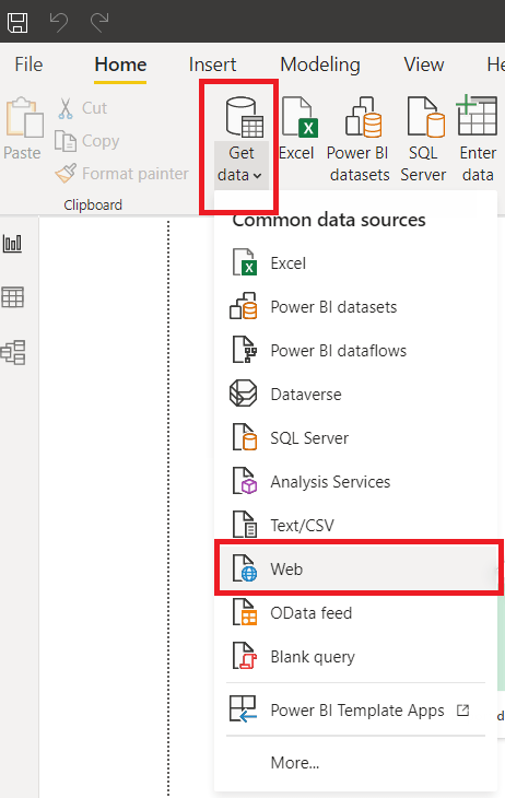
From Power BI Desktop > Click Get Data> Click Web to import data from a webpage.
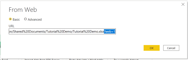
Enter SharePoint URL of CSV file > Remove any text after .xlsx in the file name > Click Ok > Login to SharePoint > Transform data as needed.
Encouraging Company Participation
Our company likes some friendly competition, but we wanted to ensure there were multiple forms of competition possible.
We have our leaderboards which will list our top performers in our pre-determined categories: Most hours, Most Improved, Most Variety, and Most Consistent. These leaderboards have the incentive of a prize at the end of the challenge, so this seemed like a pretty obvious motivator for employees to participate.
However, we thought, “What if we felt we didn’t have a chance to win in any of the categories? Would we still want to participate?”
On the dashboard, the data can be broken down into pages per employee to view their analytics. On the far left of the page, we have levels shown by pixelated hearts. Though there may be an Easter egg for employees who complete all eight levels, we wanted to make each level achievable for all employees regardless of the activities they choose to do.
We saw the levels as a way for employees to directly compare their analytics with others to have some friendly competition, plus the levels can be used to set individual goals.
Finally, we wanted to make sure all the goals and levels focused on positive achievable outcomes. For example, the levels all start at level one with a heart already filled in on each employee’s page.
By focusing on hours of movement, it is about finding the time to get active in any way you wish rather than being about specific skills within an activity like intensity. Everyone has different time availabilities but that is why we made it so you could include most movement activities as sessions. There is also a mix of big and small markers along the route to the company goal to stagger our achievements along the way.
Overall, we figured focusing on positivity around movement and adding in a few prizes, was the best way to get people motivated at Iteration Insights. What activities does your company do to encourage engagement and socializing among employees? Let us know in the comments as we are always looking to improve!
Iteration Insights Movement Challenge Updates
Week One
The 7th of June kicked off our movement challenge and we have already made great progress along our route as we passed our first two locations: the Royal Tyrell Museum and the World Famous Gopher Museum! We are also just reaching Rocky Mountain House. Be sure to check out the leaderboard to see who is on their way to winning the coveted prizes at the end of our three-week challenge!
Week one has totaled 75.4 hours of movement which is 31.9% of our company goal! Friday and Saturday had the most activity happening, with a total of 17 sessions of movement from employees on both days. Walking seems to be the preferred activity at this point, but we also have some weight training, bike riding, rock climbing, and rowing!
Our company is just warming up with our movement this week so be sure to check back next week to get updates on our continued progress!
Week Two
After our second week, we have completed 61.7% of our company goal! We are currently working through the longest stretch of our route which is 82 hours of movement to Yoho National Park. Our little dinosaur on the map is almost there!
Employees have still been enjoying walking the most after week two, with some people doing yoga, running, and workouts. It will be interesting to see if anyone tries something new in the final week to add to our list of activities! There is also a slight preference for doing movement activities at the beginning of the week since our days with the most sessions are Mondays, Tuesdays, and Wednesdays.
We are well on our way to completing our goal by the end of this week, but be sure to check back next week to find out if we pulled it off!
Week Three
The Iteration Insights Movement Challenge has officially come to a close, and we are happy to say we hit our goal (with a few days added to the challenge)! When we hit our initial end of the challenge this Monday, we were just 13.5 short hours away from our goal, so the employees requested a final push to the finish!
These three weeks of movement have been a great way for people to bond over activities and encouraged everyone to get outside throughout the workdays (before the heatwave). Everyone contributed, and we are so proud of our team!
We also have four winners from our leaderboards! The leaderboard data is as follows:
- Most Hours | 32 hours
- Most Improved | 10-hour increase
- Most Variety | 9 activities
- Most Consistent | 0.0893 standard deviation
But, of course, everybody wins with the completion of our company goal!
Thank you for following along with our challenge. We thoroughly enjoy implementing data into everything we do! If you are looking for data-related benefits for your business. Let Iteration Insights help and contact us today.
About the Dashboard Creators

Diana Arciniega is an Analytics Consultant of Iteration Insights, a tech-enabled, data analytics solutions provider located in Calgary, Alberta.
Diana has a Bachelor’s of Science from the University of Calgary, Majoring in Actuarial Science and Minoring in Statistics. In June Diana will graduate with a certificate in Business Intelligence and Data Analytics from SAIT. She is currently working towards a Microsoft Certified Data Analyst Associate Certification. She is very passionate about Storytelling with data, and empowering others throughout their data-driven journey.
In her spare time she loves reading fantasy and science fiction and playing board games with friends.

Eric Kolesar is an Analytics Consultant of Iteration Insights, a tech-enabled, data analytics solutions provider located in Calgary, Alberta.
He graduated from the University of Calgary with a degree in Economics and a minor in Computer Science. He will also soon be completing his Business Intelligence Data Analysis and Reporting certification from the Southern Alberta Institute of Technology. Along with those he is currently Microsoft Certified in Azure Data Fundamentals and is working towards a Microsoft Data Analyst Associate Certification.
Outside of work you can find Eric watching hockey, playing video games, or following anything tech-related. Recently he has also been getting back into golf.