 article")
Welcome to the 2022 Iterations Insight Movement Challenge!
This challenge has become a summer staple in our organization. It’s a way to promote movement and health for our employees while also providing an exciting and interesting challenge to our summer practicum students.
Sections
- Introduction
- Power BI Interactive Dashboard
- Scaling New Heights and the Seven Summits
- The Analytics Teams
- About the Movement Challenge
- Organizational Growth and Knowledge Transfer
- Let’s Get Moving
- Results
- About the Dashboard Creators
Our practicum students have created the Power BI dashboard found above to help track our progress as an organization, as teams, and as individuals. You can interact with the dashboard to access different data types related to the Movement Challenge as it progresses.
The first thing you will notice is our dashboard theme. Last year our students chose a retro game theme. This year they went much further back in time and added a prehistoric flair to our outdoor theme.
To enter the dashboard, click the Start button. Along the left side of the dashboard, you will see a menu that will allow you to navigate through the report pages, including:
- Cave: a page that shows an overview of all the movement data for the organization. This is the landing page when you enter the Dashboard.
- Crew: a page that highlights the progress of a given team through the challenge.
- Dwellers: a page that highlights the individual progress of an individual in the challenge.
- Leaderboard: a page that shows the individual progress of all competitors and shows the best performer across four categories.
Now let’s take a bit of a deeper dive into how this project came to be!
Scaling New Heights and the Seven Summits
This year, we wanted to pick a theme and goal that represents our ongoing effort in 2022 of strengthening. We strive to strengthen our organization and celebrate our ability to reach milestones as we continue to grow together. We chose Scaling New Heights as our tagline to reflect this.
Every year when planning the movement challenge, we choose a tangible and interesting subject to represent our goal. This year we wanted to pick something on a big scale that had a global appeal and fit with our theme. The Seven Summits, a famous mountaineering challenge in which you climb a series of famous mountains, one on each continent was a perfect fit!
There are a couple of versions of this challenge, but the version we chose included:
- Mount Kosciuszko, Australia
- Mont Blanc, France/Italy
- Mount Vinson, Antarctica
- Kilimanjaro, Tanzania
- Denali, United States
- Aconcagua, Argentina
- Mount Everest, Nepal
When totaled together, these mountains represent 39,826 m of elevation, which is a pretty tall order!
The Analytics Teams
This year we wanted to drum up a little competitive spirit by dividing our participants into teams that would race to the top of each mountain. Given the size of our organization, we decided that four teams would work well.
This gave us the perfect opportunity to use some team names that highlighted what we do as an analytics organization. We chose the four types of analytics as to the team names:
- Descriptive
- Diagnostic
- Predictive
- Prescriptive
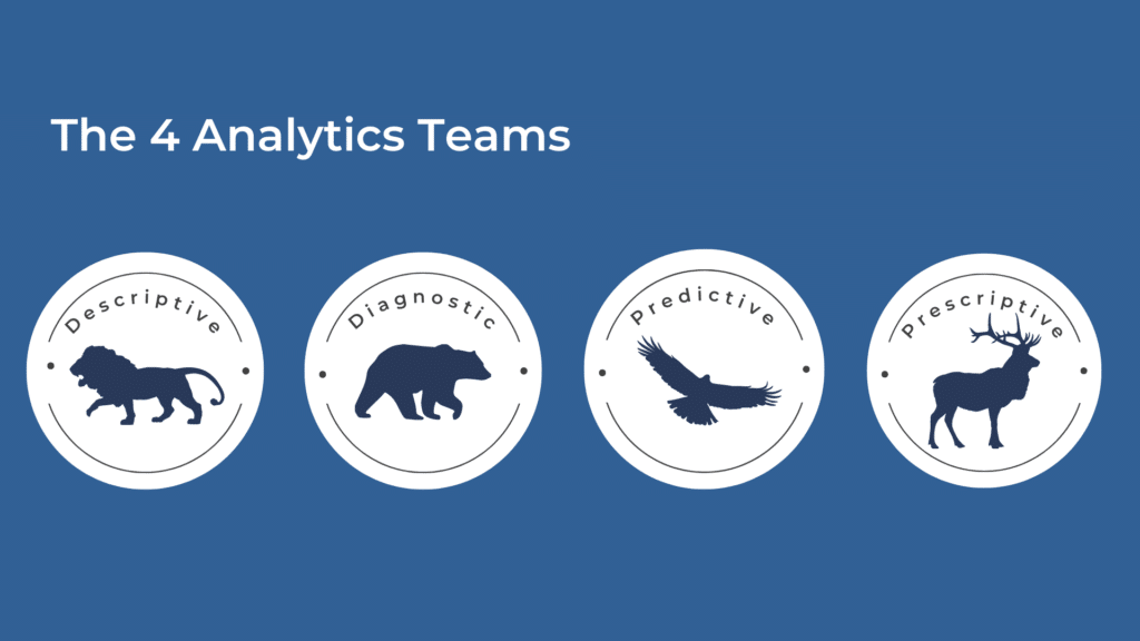
To fit our wild prehistoric theme, we decided on an animal mascot that we felt fit with the nature of each type of analytics. You can learn more about the four types of analytics here.
About the Movement Challenge
Company Goal
For each team to complete 55 hours of movement.
Duration
June 13th to June 26th, 2022.
Measurement
To ensure 39,826m of climbing represented a reachable goal for each of our teams, we measured our movement as if the time spent moving had been spent climbing a ladder at the height of each mountain.
For each minute of movement, an individual and their team got 12 meters closer to the top of the mountain they were climbing together.
Measuring this way also allowed us to include any movement or activity and helped promote an inclusive challenge.
Leaderboards
On top of recognizing team achievements, we also wanted to recognize the individuals that excelled in the categories mentioned below. The Leader Board report page on the dashboard displays all the individual statistics for the participants and the current leader in the following four categories:
- Most Hours
- Most Improved
- Most Variety
- Most Consistent
Dashboard
Our theme this year for our challenge was “Scaling New Heights.” To support this theme, our students created a complimentary mountain-themed dashboard with some fun prehistoric details.
Creating the Dashboard
This challenge provides an opportunity for our Summer Practicum Students to gain first-hand knowledge about creating projects from start to finish. This year, our Dashboard was created by our wonderful students Chinazom Eloji and Edirin Ogbudje.
They chose to divvy the work up, with Chinazom primarily working on the front end of the Dashboard creating the visual elements and visualizations, and Edirin focussed on the back end creating the data model and calculations.
The Back End
The data model for this dashboard is a standard star schema model with dimension tables for the Activities, Employees, Dates, and a Fact table created from a CSV file pulled using a similar Strava extension as the one used in the Movement challenge this year.
However, due to changes with the chrome extension, the CSV file no longer displayed the activity type associated with each session. This posed a challenge as many of the leaderboard categories and visualizations depend on the type of exercise conducted during each session.
Our practicum students determined the best course of action to solve this problem was to have employees include the type of activity (i.e. hiking, walking, biking, weight lifting) that they were doing in the title of their Strava app entry and separate this element from the rest of the title using a dash. This would allow us to differentiate the activities.
To account for user error in this case, the “Other” category was included in the activities dimension table. This would ensure that any activity not properly categorized could still included in the dashboard.
The Strava app has many different categories, and we wanted to limit the number of activity categories that we included on the dashboard to ensure that the visuals contained only the colours that reflect the Iteration Insights brand. We created a dimension table, mapping the specific activities to more general categories. This meant conglomerating activities like rowing and canoeing into more general categories like boating.
Because we were downloading a CSV file from Strava daily, we had to find a way to ensure that Strava was pulling data from the correct file. To do this a parameter was created in Power Query to ensure that the data model was referring to the most recent dataset. This was done by assigning the local time to the dataset when it was preloaded.
There was also the issue of translating the timecodes that Strava provided for duration into minutes to do the meter-to-minute calculations. Because Strava provides the duration in a standard (hh:mm:ss) format, the columns were split based on position and then the hours, minutes, and seconds columns and translated into a single column with the total minutes for each session.
Once the dataset was prepared in this way, the measures required for the dashboard visualizations could be created.
The Front End
The mountain theme of this dashboard naturally arose from the Scaling New Heights challenge tagline and The Seven Summits challenge goal. Rocks, cavemen, mountains, animals, and other outdoor images were used to bring the theme to life!
Custom fonts, images composed in Canva, employee pictures stylized with befunky.com, and animal team logos were integrated into the dashboard to ensure every element fit the theme. Even the buttons on the navigation pane are rocks! Mock-ups of the visualizations were created in PowerPoint before the bulk of the backend work. This ensured that the dataset was prepared correctly.
It was important to integrate the company colours and branding into the dashboard representative of Iteration Insights and we did our best to keep associability in mind as well when choosing font and visualization colours.
The individual elements were composed using Canva and originally included in the background before it was imported into Power BI. However, using this method affected the quality of some of the elements. To improve this, the impacted elements were removed from the dashboard and were reuploaded and placed individually.
Moving elements like the spinning logo, bouncing location marker, and flickering flames were incorporated to create a more dynamic and engaging experience. To achieve this, gifs had to be created and stored on an online platform where Power BI could reference them.
A DAX calculation also had to be created to ensure that the bonfires would not appear at the top of each mountain until a team had done enough minutes of exercise to complete that milestone. This created the perfect visual environment to showcase the visualizations and conveyed the information in both a branded and entertaining way.
Organizational Growth and Knowledge Transfer
Iteration Insights is a growing organization, bringing on new specialized individuals and allowing our long-term employees to grow into specialized roles. As part of that growth process, we often must determine how to reallocate existing responsibilities to the right individual within the organization. We also strive to challenge our people and provide the best environment for their skills to improve.
Knowledge transfer has become a huge part of that process, and it was evident throughout the planning and execution of this challenge.
This was an invaluable opportunity for many individuals in the organization to collaborate, and for knowledge to be passed from senior to junior employees, who had more opportunities to learn and grow through this work.
Let’s Get Moving
For this movement challenge to be successful, we had to ensure that we promoted participation internally. To do this, we regularly communicated with our whole team via Microsoft teams. The communication process gave us a chance to integrate our human resources practicum student Janessa, who met with members of our business support team regularly to craft these internal communications.
Much of this communication was done just before the challenge to ensure that everyone was signed up correctly for Strava and knew when the challenge was starting and how to participate. Throughout the challenge, we have kept up this communication, updating everyone on the progress of each team and using polls to organize a fun family walk in Nose Hill Park.
And of course, we are providing the best incentive of all: prizes! The winning team will get a team dinner at the restaurant of their choice, and each of the individuals who do best on the leaderboard will be getting a gift card to MEC.
Results
The Results are in. We completed 174 hours of movement, climbing to a staggering height of 125,534 m.
Here are the final rankings of our teams at the end of the movement challenge:
- Team Prescriptive: 47,499 m (65.97 hrs)
- Team Predictive: 40, 414 m (56.13 hrs)
- Team Descriptive: 23,357 m (32.44 hrs)
- Team Diagnostic: 14,264 m (19.81 hrs)
And the winner is Team Prescriptive, who exceeded our final goal by 7,673 m! Thank you for following along with our 2022 Movement Challenge, we can’t wait to see what’s in store for next year.
Happy Summer!
About the Dashboard Creators

Chinazom is a Analytics Consultant of Iteration Insights, a tech-enabled, data analytics solutions provider located in Calgary, Alberta.
Chinazom has a Bachelor’s of Science in Geological Sciences, Master’s of Science in Petroleum Geosciences and a postgraduate certificate in Business Intelligence and Data Analytics from Southern Alberta Institute of Technology. She is very passionate about diving into data to produce actionable insights to help make data drive business decisions.
In her spare time she loves hiking, exploring new places and food.

Edirin is an Analytics Consultant of Iteration Insights, a tech-enabled, data analytics solutions provider located in Calgary, Alberta.
He is experienced in Project Management and certified in Microsoft Azure Data Fundamentals. Edirin has a Master’s degree in Information Technology with Security from University of Greenwich and a Certificate in Business Intelligence: Data Analysis and Reporting from Southern Alberta Institute of Technology (SAIT). He loves working with data to identify hidden patterns and answer business questions.
Outside of work he loves playing video games, watching soccer, taking morning walks, travelling and spending quality time with loved ones.
