
For most people, their first touchpoint with data and data-heavy reporting is in Excel, regardless of whether they work in Sales, Finance, or Operations. Asking them to then move to an entirely different platform such as Tableau can understandably generate some resistance.
We have all experienced having to adapt to a new application or UI and we find ourselves taking longer to do relatively simple things (I know something as trivial as Facebook changing their layout can be frustrating for instance). Most people already have their days full and many demands on their time, and so the idea of learning a new program can seem daunting.
But there is hope! Learning anything new is much easier and generates much less resistance if it contains familiar elements.
For learning Tableau, this is where Excel comes in.
Most Excel users have seen or used pivot tables, and they can be easily recreated in Tableau. When creating a dashboard, it helps to create one that contains a pivot table as the main feature so that your users can see the familiar starting point.
Once the user is on a familiar footing with the pivot table, they will be more open to the reporting enhancements to pivot tables that tableau has to offer. The 4 improvements to pivot tables suggested below will help ease users into the Tableau interface.
Highlight Pivot Tables
A common use for pivot tables is to get a quick overview of how business units are performing. Take for instance the example of a store manager who is trying to make scheduling decisions and would like to ensure that there are people available for the hours that the store makes the most revenue.
A table such as the one below is a common one a store manager might use. It lays out exactly what hours on what day the store generates the highest revenue. However, with a visual this simple it would take some time to scan through the table, and with the sheer size of it, there is a high likelihood of making an error.
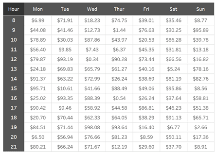
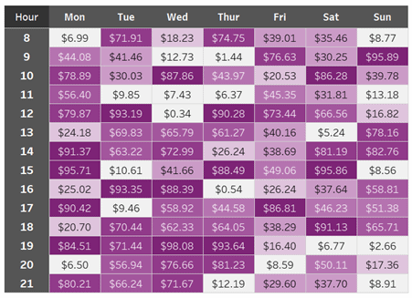
This is where Tableau can come in handy. By placing the pivot table in Tableau, and adding simple colour coding, the information jumps off the page. It greatly improves ease of use and helps reduce errors along the way.
Tooltips
Dashboards are often designed to be used by a wide variety of people, and as much as a report might be reworked to suit the greatest number of people, every individual will have slightly different needs. Some users might require more detail and be more comfortable with data than others but accommodating every single requirement can crowd a dashboard and take away from the key insights it is looking to deliver.
In such a situation, the interactivity of Tableau’s reports can prove useful, and tooltips are a good option here. Tooltips are details about the data which pops up when a user hovers over a point in the visualization. They allow you to provide more detail specific to the users who require it while taking up no extra space on the dashboard. They are especially powerful because they allow you to link to other worksheets.
Take for example a dashboard that allows regional product managers to see how their Line of Business (LoB) has been doing throughout the year. Although the overview would be useful, each Product Manager might want a quick look at how each subcategory of their LoB is performing.
As seen in this dashboard, having a tooltip can unobtrusively allow a product manager to better understand which subcategories are performing best, or what their performance overtime was like. It allows a simple pivot table or a general dashboard to speak to a larger audience as well as a more specific one.
Linked Worksheets
In Tableau, one worksheet on a dashboard can be used as an action filter to the other worksheets on the dashboard. This means that any large table on a dashboard can act as a starting point for visualizations of more specific pieces of data.
In a situation where a regional manager wants to make decisions for their unit, they might need to see how their region is performing every month. But each manager might also be interested in seeing the profits broken down by city. It would be possible to use a tooltip here, but the number of cities might be too large to fit in a tooltip and doesn’t allow for a deeper perusal of the data.
In this scenario, using Tableau to filter to other worksheets by linking them so managers can do a deep dive into their respective regions is a good option. As you can see, linked worksheets automatically create advanced filtering.
Clicking on a region name displays the data for the year, for all the cities in that region, but clicking on the specific cell filters to that month and region, allowing for a narrower view. These are easy to set up and allow your user far more control over the experience.
Parameters in Tableau
Similar to filters, parameters offer users a way to directly adjust a visualization by changing an input. But the key strength of parameters is that they allow users to input and visualize scenarios not otherwise available in the data. This makes parameters very powerful and can greatly enhance the value of your report.
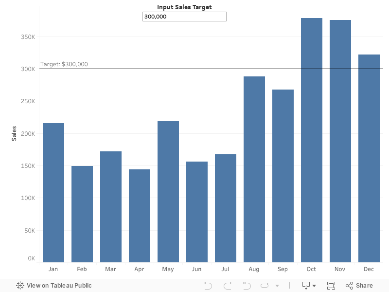
Let us say you have created a report used by the operations team that looks at revenue generated over time. Different product managers might have different targets, or their targets may keep changing over time. Either way, they would want to see the performance relative to a target, which is of course not contained in a database.
This is easily solved by creating a parameter. By allowing your user the option to directly input a target, they have the power to update the visualization themselves and perform the analysis they need.
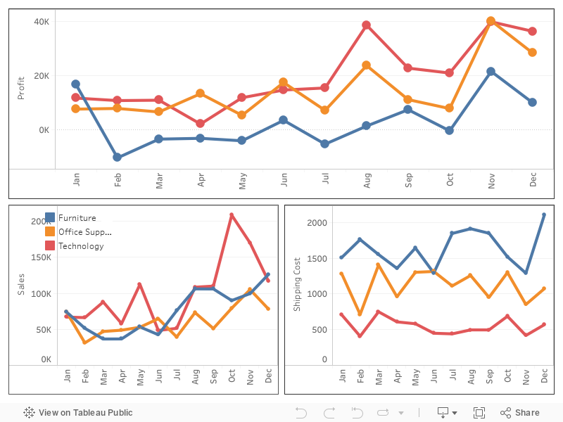
Like the previous example, it can often be the case that users need to look at the performance of multiple dimensions to make decisions. A marketing manager might need to look at a variety of factors when deciding what products to focus their efforts on. For instance, they will likely want to look at the profit and overall sales, while also keeping in mind what shipping costs are associated.
As seen in the dashboard below, having all the same measures on the same chart would be overwhelming, and having three separate charts of the same type can take up a lot of space.
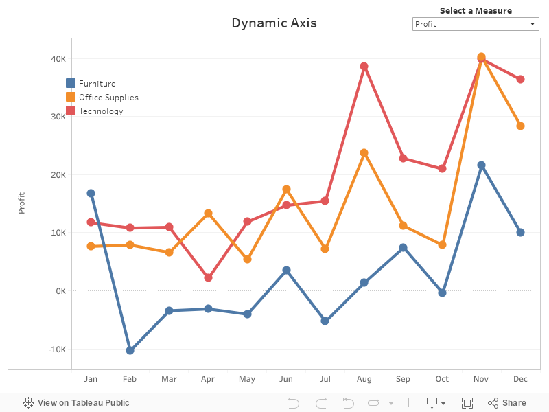
But updating one of these charts with a parameter to dynamically change which measure is displayed, can solve both these problems.
These four options are quick ways to help users become more comfortable with Tableau. Something as simple as highlight tables and tooltips greatly improve readability and the amount of data a pivot table can offer – without sacrificing space.
Linked Worksheets are a slightly more advanced option to really allow users to drill down into their data. Parameters are a great way to show users the power of Tableau by allowing them to expand the capabilities of their reporting.
