
Believe it or not, it is not only possible to accomplish more by doing less, it is mandatory.
– Tim Ferris
Power BI reports allow a user to explore a dataset easily. Slicing data is vital but requires the values to exist in the dataset. Values in the dataset are static, and applying filters and slicers will not change them, limiting reporting. However, sometimes, you want data classified differently and dynamically based on what other filters have been selected.
For instance, a company selling products can have an extensive product line with multiple sales regions and outlets. Someone doing analysis will want to see what the high-selling products are and which ones are lagging. These outcomes may change in different contexts. A product selling well in one region or time of year may sell poorly in another. Identifying these differences is the first step in taking any action.
A Pareto chart is a visual based on the Pareto Principle. Also known as the 80/20 rule, the Pareto Principle says that 80% of the results come from 20% of the effort. In the context of sales, 80% will come from 20% of the products. More or less.
In this blog, I will use the Adventure Works dataset to create a Pareto chart to analyze product sales. The goal is to categorize products based on how well they are selling dynamically and further filter products based on these dynamic categories.
Sections
Measures
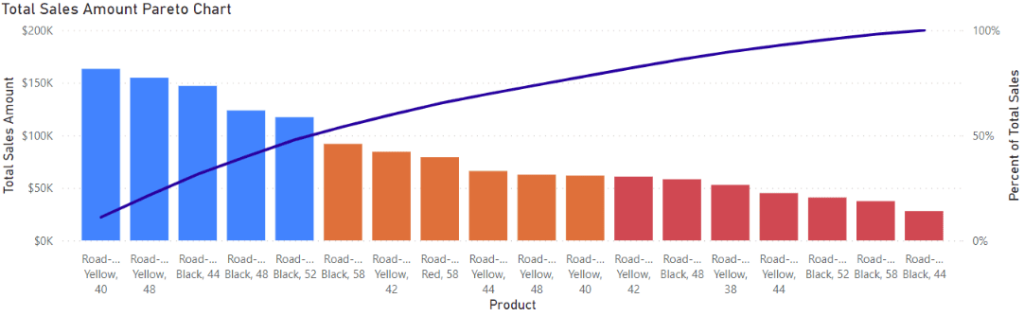
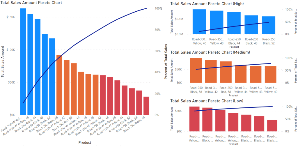
The goal we are going after is to create the Pareto chart shown below. This visual shows several products and their total sales amount as the columns (filtered for Road Bikes sold in August 2019). Products are ordered from highest to lowest sales, with the line showing the cumulative percentage of total sales moving from left to right. The colouring is done dynamically and will be the main focus of this blog: producing categorization dynamically based on a subset of selected products.
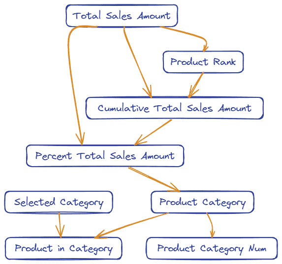
We will create a large number of measures in this report. Each has a role, and they often depend on previous ones. To help organize these, a flowchart below shows all the measures and the relationship between them. As you read on, refer to this image to keep everything organized.
Pareto Classification
To begin, we start with a base measure on which classification will be based. The choice of what to calculate here is wide, and the rest of the process is agnostic to what it is. I am using Total Sales Amount to keep things simple, but more complex calculations could be done.
Total Sales Amount = SUM ( 'Sales'[Sales Amount] )
The next step is to rank each product by Total Sales Amount. We need this to calculate cumulative totals based on the ordering of products by the sales amount.
Product Rank =
RANKX (
  CALCULATETABLE (
     'Product',
     ALL ( 'Product'[Product] )
     ),
  [Total Sale Amount]
 )
The Product Rank allows us to calculate cumulative amounts. This measure sums up the Total Sales for each product with an equal or higher rank (smaller rank numbers indicating higher sales).
Cumulative Total Sales Amount =
VAR _rank = CALCULATE ( [Product Rank] )
RETURN
CALCULATE (
   [Total Sale Amount],
   FILTER (
        CALCULATETABLE ( VALUES ( 'Product'[Product] ), ALL ( 'Product'[Product] ) ),
       [Product Rank] <= _rank
   )
)
The cumulative sales amount is then converted to a percentage of the total sales for all the products, allowing us to determine which products, in order of sales, equal a total percentage of all sales.
Percent of Total Sales =
VAR _totalSales = CALCULATE ( [Total Sale Amount], ALL ( 'Product'[Product] ) )
VAR _cumulative = [Cumulative Total Sales Amount]
RETURN
DIVIDE ( _cumulative, _totalSales )
Finally, we can organize each product into its category. In this case, the ‘High’ category is for the group of highest-selling products, which account for 50% of the sales amount for all products. Likewise, the ‘Medium’ group shows those in the top 80% of sales who are not already in the ‘High’ group. The rest of the products have the least sales and collectively only account for 20%.
Product Category =
VAR _rankPct = [Percent of Total Sales]
RETURN
SWITCH ( TRUE (),
   _rankPct <= 0.5, "High",
   _rankPct <= 0.8, "Medium",
   "Low"
)
Classification Filtering
The next step is to filter by the outcome of the categorization. We need a new table in the data model containing all the categories we are using.
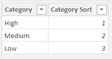
This table does not connect to anything else in the data model. It provides values for a slicer (Category column), which the measures below use. The first returns which category is selected, or ALL if none are selected.
Selected Category = SELECTEDVALUE ( 'Product Categories'[Category], "ALL" )
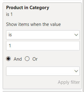
The second measure uses the selected category from the slicer and compares it to the product category. It returns a 1 if it matches and a 0 if not.
Product in Category =
VAR _selected = [Selected Category]
VAR _category = [Product Category]
RETURN
IF ( OR ( _category = _selected, _selected = "ALL" ), 1, 0 )
Pareto Plot
Now, we can produce a Pareto Plot shown at the start of this blog. To make this chart, create a column and line visual with the following measures added: The product name from the Product Dimension, the Total Sale Amount measure we started with as the column values, and Percent of Total Sales as the line.
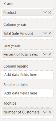
We need one more measure for the colouring.
Product Category Num =
VAR _category = [Product Category]
RETURN
SWITCH ( _category,
   "High", 1,
   "Medium", 2,
   "Low", 3
)
Use as below to set the colours.
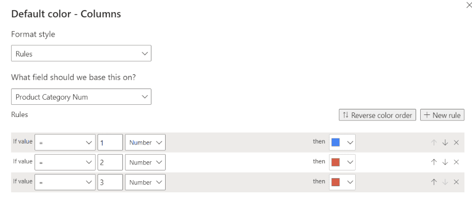
Finally, add the Product in Category measure as a filter on the visual, filtering for products with a value of 1 and you will have the plot we started with.
Below is the chart we started with (resized) along side three other charts which are filtered for high, medium, and low.
Conclusion
Pareto analysis of your data can provide valuable insights and help make decisions. It shows which products (or other entities) are most responsible for a result. In most cases, a minority of products are responsible for most of a company’s sales. Analyzing products by what percentage of sales they generate can be helpful in decision-making and relies on being able to filter and drill down to the most (or least) valuable products. In this blog, I have shown a process for dynamically categorizing and filtering products into Pareto categories.
