
“Relationships don’t always make sense. Especially from the outside.” – Sarah Dessen
The foundation of any good Power BI report is a well-made data model.
Power BI prefers its data to be structured in a Star Schema. This is where fact tables holding the numbers are filtered by dimensions holding the qualitative data.
Once a data model is created, generating the rest of the report is usually simple from a calculation standpoint.
However, sometimes a simple data model does not meet all of the requirements for the report. The model easily handles most of the visuals, but there are one or two which defy it.
Depending on the calculation required, various solutions exist. But these could result in complex models with duplicate tables or even bidirectional relationships.
An alternate solution, which leaves the data model pristine, is to get creative with the DAX measures. Doing so makes your model work in ways that go beyond the physical model.
DAX is a language that works within Power BI and Analysis Services. It is also used to create expressions and calculations.
In this post, I will be showing several ways you can alter and play with the filtering behavior of a data model using DAX measures.
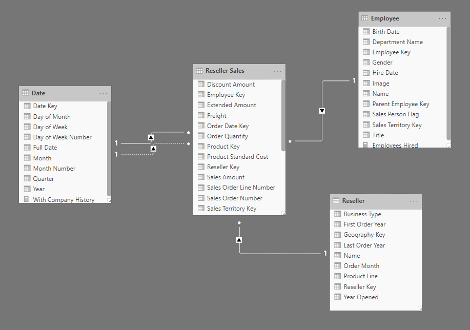
The Data Model
The data we are using in this demo is from the AdventureWorks data warehouse. We are using the Reseller Fact table with the Date, Employee, and Reseller dimensions.
Each dimension has a one-to-many relationship filtering the fact table. The Date dimension has two relationships to the fact table: an active one to Order Date and an inactive one to Shipping Date.
The First Visual
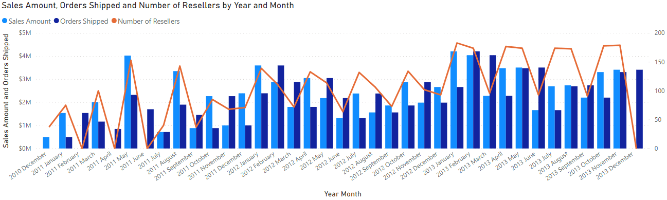
For the first visual, I want to see a monthly breakdown of the Sales Amount ordered and shipped, as well as the number of Resellers ordering products.
This will be a “Line and cluster column chart” showing the Sales Amounts in the columns and the number of resellers as the line value.
We can easily accomplish the Amount sold each month using the following steps.
- Create a “Line and cluster column chart.”
- Add the Year and Month from the date table to the X-axis.
- Add the Sales Amount column from the Reseller Sales table to the column values.
The Sales Amount will automatically sum up using the Order Date. This is because it is the active relationship between the Date dimension and the Reseller Fact table.
To show the value of the orders which have shipped, we need to create a measure.
Like most measures, this one starts with CALCULATE. It uses the expression we want to calculate as the first argument and any filters we want to add as subsequent arguments.
The filter argument in this measure is the USERELATIONSHIP function. This allows you to select which relationship between tables will be used within the CALCULATE function.
The relationship needs to exist in the data model to be used in USERELATIONSHIP. This is usually an inactive relationship.
In this case, we enter the columns involved in the inactive relationship between the Date dimension and the Shipping Date of the fact table.
This makes the specified relationship active and the existing active relationship inactive.
Adding the above measure to the column values of the visual gives us the value of the shipped products for each month beside the amount ordered.
The last piece to add to this visual is the number of resellers purchasing orders every month, which requires another measure.
We need to count the distinct number of Resellers placing orders every month. So, we have a DISTINCTCOUNT on the Reseller names in the Reseller dimension.
Just having this would produce the same value for each month. This is because the cross-filter direction of the relationship runs from the dimension to the fact. So, counting values in the dimension results in an unfiltered value.
Adding the CROSSFILTER function allows us to specify how the filtering will work in the context of this CALCULATE expression.
CROSSFILTER takes three arguments. The first two are the columns involved in an existing relationship in the model.
The third argument specifies how the measure will filter the relationship. The options are:
- None: Turns off filtering
- OneWay: Sets the cross-filtering direction and makes the “one” side of the relationship filter the “many” side
- Both: Changes the existing cross-filtering setting and makes the relationship bidirectional
In this case, we are using Both, which allows the Reseller Fact table to filter the Reseller Dimension.
So by extension, the Date table is filtering the Reseller Dimension by which resellers placed orders in a given month.
Note: We could also add the USERELATIONSHIP function from the first measure to the Number of Resellers measure. Doing so allows us to get the number of resellers being shipped to each month.
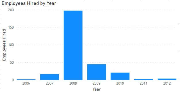
Employees Hired by Date
The last thing we want to do is create a visual which displays the number of employees hired by year.
This will be a “Stacked column chart” with Year on the X-axis and the number of Employees hired that year as the Value.
A look at the data model above shows that there is no relationship between the Date and Employee table.
We can’t use CROSSFILTER to go through the Reseller Sales Fact table. That will only give us the Employees who had sales in a given year, which is not what we want.
What we need is a direct relationship between the Date and Employee Dimensions.
Now, it is possible to add an inactive relationship between the tables. We can also add a measure that activates the relationship with the USERELATIONSHIP function.
However, can we do this without altering the data model?
Of course, by using the TREATAS function.
TREATAS produces a table that, within a CALCULATE function, acts as a filter.
The first argument is a table-valued function of the column(s) we want to use to filter a table. It then uses that table as a filter for the column(s) listed in subsequent arguments.
Here we use Date values to filter the Hire Date column of the Employee table. The result is that we are creating a relationship between two tables where there is no relationship in the data model.
Although TREATAS does work well for the purpose here, it is a relatively slow function. It can also affect the performance of your report.
You should add TREATAS to your toolbox of tricks, but remember that it should not be your go-to function.
In the case above, creating an inactive relationship between the Date and Employee tables would have resulted in a faster report.
Using Special DAX Functions
When creating a report or dashboard in Power BI, it is essential to start with a clean data model.
The data model should allow the calculation of most of the report. However, sometimes the model falls short.
This is where you use special DAX functions such as USERELATIONSHIP, CROSSFILTER, and TREATAS.
These can allow you to create the visuals you want without changing your data model and potentially creating errors in other visuals.
