
Sections
Introduction
The Power BI Service is a really powerful free download tool that offers so many options for visualizations. However, it can be difficult to remember how and when to use the different visualization tools and options. We really wanted to focus on the basics so that this can serve as a resource as you continue your work in Power BI and explore all the interactive visualizations.
Check out our interactive dashboard created in the Power BI service, or read all the content included in the dashboard here in the blog.

Stacked Bar Chart
The Stacked Bar Chart displays numerical values over time or compares values between different groups represented through rectangular bars on a graph. It also has categorical values within the bars themselves, separated by lines. Each bar in the chart represents a whole and is divided into sub-bars that represent the different categories. Use this visual to compare numeric and categorical values.
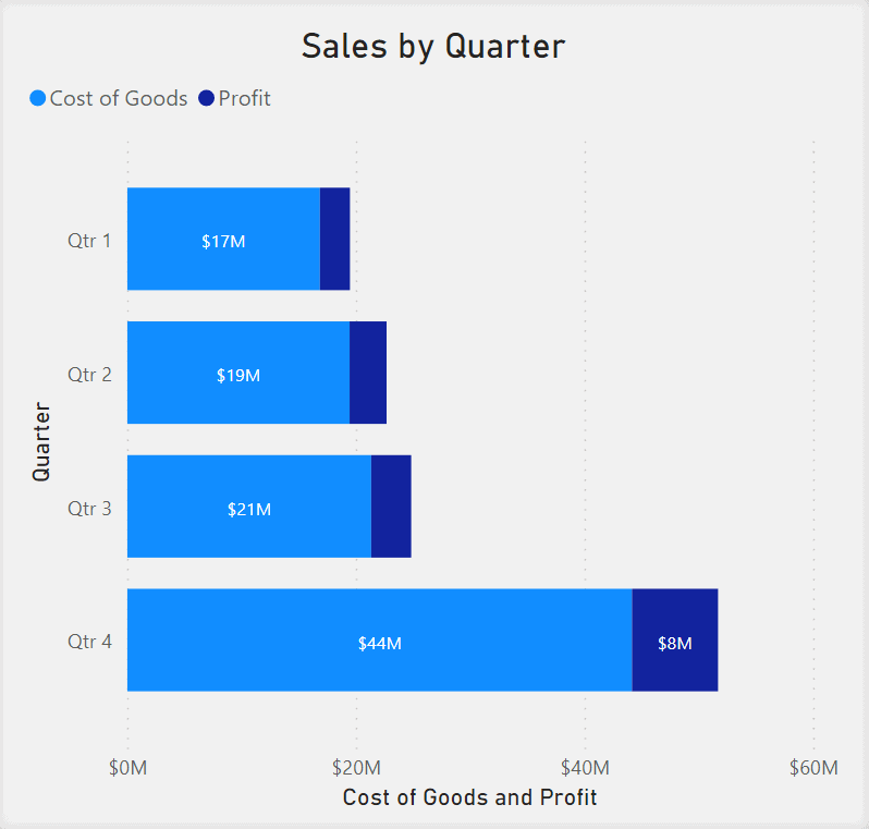
The Stacked Bar Chart can be used to display the Total Sales of a company by quarter. We can then further separate the bars into two categories displaying the proportion of each Category to Profit. In this visual, we want to know how much of the Total Sales for each Category is Cost of Goods versus Profit.
Stacked Column Chart
The Stacked Column Chart displays numerical values over time or compares values between different groups represented through rectangular bars on a graph. It also has categorical values within the bars themselves, separated by lines. Each bar in the chart represents a whole and is divided into sub-bars that represent the different categories. Use this visual to compare numeric and categorical values.

The Stacked Column Chart can be used to display the Total Sales of a company by quarter. We can then further separate the bars into two categories displaying the proportion of each Category to Profit. Then we can find out how much of the Total Sales for each Category is Cost of Goods versus Profit.
Clustered Bar Chart
The Clustered Bar Chart displays numerical values over time or compares values between different groups represented through rectangular bars on a graph. It also has several bars clustered next to each other, representing another data series of categories to further compare the numerical values versus categorical values.
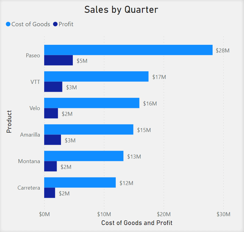
The Clustered Bar Chart can be used to display the Total Sales of a company by quarter. We can represent Total Sales as two clustered bars where one represents the proportion of Cost of Goods to Sales and the other represents the proportion of Profit to Sales.
Clustered Column Chart
The Clustered Column Chart displays numerical values over time or compares values between different groups represented through rectangular bars on a graph. It also has several bars clustered next to each other, representing another data series of categories to further compare the numerical values versus categorical values.
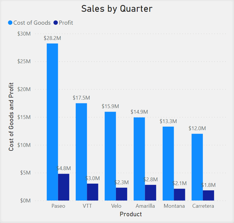
The Clustered Column Chart can be used to display the Total Sales of a company by quarter. We can represent Total Sales as two clustered bars where one represents the proportion of Cost of Goods to Sales and the other represents the proportion of Profit to Sales.
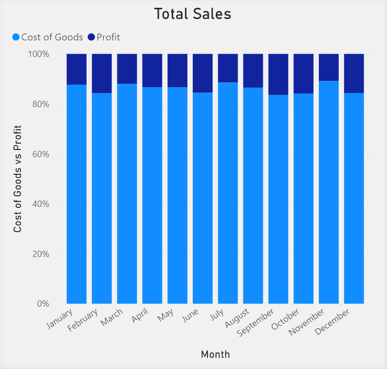
100% Stacked Bar Chart
The 100% Stacked Bar Chart displays numerical values over time or compares values between different groups represented through rectangular bars on a graph. It also displays percentages of the data as stacked bars where the total of all bars stacked together equals 100%.
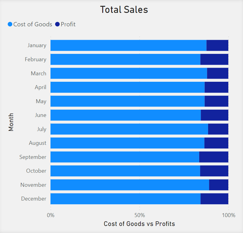
The 100% Stacked Bar Chart can be used to display the Total Sales of a company by quarter. Each bar represents a percentage of 100% of Total Sales. The bars are divided into two stacked bars where each stacked bar represents the percentage of Cost of Goods versus Profit.
100% Stacked Column Chart
The 100% Stacked Column Chart displays numerical values over time or compares values between different groups represented through rectangular bars on a graph. It also displays percentages of the data as stacked bars where the total of all bars stacked together equals 100%.
The 100% Stacked Column Chart can be used to display the Total Sales of a company by quarter. Each bar represents a percentage of 100% of Total Sales. The bars are divided into two stacked bars where each stacked bar represents the percentage of Cost of Goods versus Profit.
Line Chart
The Line Chart is a series of data points represented by dots and connected by straight lines. The Line Charts are used when you want to analyze progression over time. The Line Chart can have multiple data series displayed, represented as different lines and usually different colors.
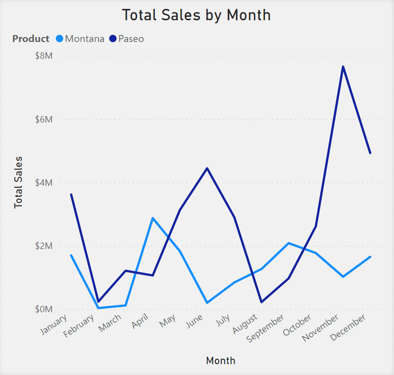
The Line Chart can be used to analyze the trend of Profit and Cost of Goods for a company monthly.
Area Chart
Similar to the Line Chart, the Area Chart is a series of data points represented by dots and connected by straight lines. To demonstrate volume, the Area Chart also has the area between the axis and the line filled with color. Use this visualization tool if you want to display the change over time while emphasizing the magnitude of change with color.
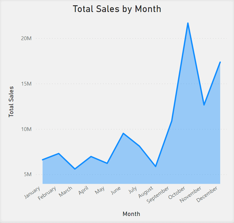
The Area Chart can be used to analyze the trend of Total Sales for a company monthly. The Area Chart is best used for illustrating large differences between your values. The shaded area of The Area Chart emphasizes the changes in Total Sales month by month.
Stacked Area Chart
Similar to the Area Chart, the Stacked Area Chart is a series of data points represented by dots and connected by straight lines. The Area Chart has the area between the line and the axis shaded with color, and the shaded area is divided into stacked categories, with each stacked area representing a proportional value of the Total.

The Stacked Area Chart can be used to analyze the Total Sales for a company monthly. The area of the chart can be divided into stacked areas representing the proportion of Cost of Goods and Profit to the Total Sales of the company.
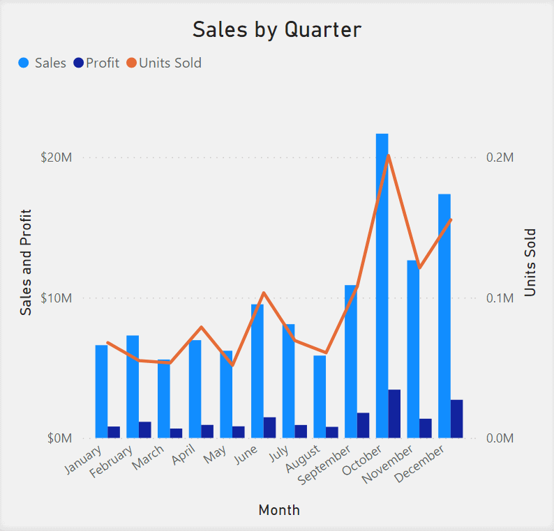
Line and Stacked Column Chart
The Line and Stacked Column Chart combines a Line Chart and a Stacked Column Chart into one visual. A Line Chart is a series of data points represented by dots and connected by straight lines that show progression over time. The Stacked Column Chart displays numerical values over time or compares values between different groups represented through rectangular bars. The Stacked Column chart also displays the bars divided into stacked bars that display the proportional values of another dimension. Use the Line and Stacked Column Chart when you want to make a quick comparison between two categories.
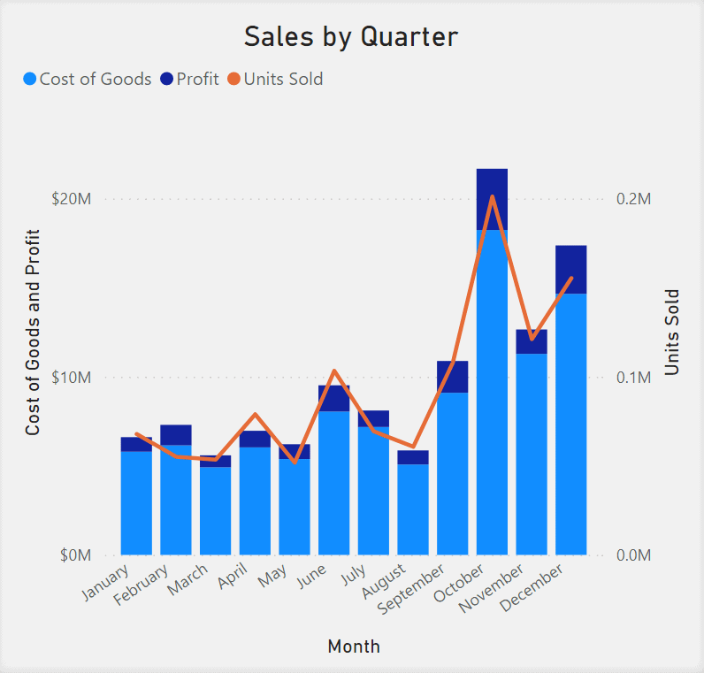
The Line and Stacked Column Chart can be used to compare Total Sales and the Number of Units Sold. The Total Sales over a monthly basis will be your Stacked Column Chart, with the stacked bars divided into Total Profit and Cost of Goods in proportion to Total Sales. The Line Chart on top of the Stacked Column Chart can represent the progression of Total profit over the same period.
Line and Clustered Column Chart
The Line and Clustered Column Chart combines the Line Chart and Clustered Column Chart into one visual. A Line Chart is a series of data points represented by dots and connected by straight lines that display trends over time. A Clustered Column Chart displays numerical values over time or compares values between groups, represented through rectangular bars on a graph. The Clustered Bar Chart also has several bars next to each other, representing another series of data categories to compare the numerical values and categorical values. Use the Line and Clustered Column Chart when you want to make a quick comparison between two data series.
The Line and Clustered Column Chart can be used to compare Total Sales and the Number of Units Sold. Total Sales over a monthly basis will be your Clustered Column Chart, with two clustered bars representing the proportions of Cost of Goods and Profit to Total Sales. The Line Chart on top of the Clustered Column Chart can represent the progression of Total profit over the same period.
Ribbon Chart
The Ribbon Chart displays ranked data categories illustrated through ribbons, where the highest rank is always displayed on the top ribbon for each period. This Ribbon Chart helps visualize how a given category ranks throughout a period.
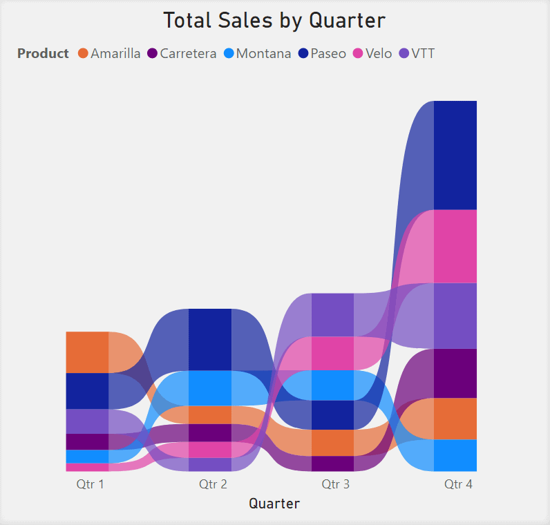
Use the Ribbon Chart for an example, such as ranking Total Sales for Products sold every quarter. The Ribbon Chart can visualize what company product is ranked as selling the most for each quarter.
Waterfall Chart
The Waterfall Chart illustrates how an initial value is affected by positive and negative changes. The chart shows a running total as values are added or subtracted. The values are shown as bars on a graph, with the direction of the bars representing negative or positive values. The bars are also color-coded, which allows the user to quickly notice the increases and decreases in their data.
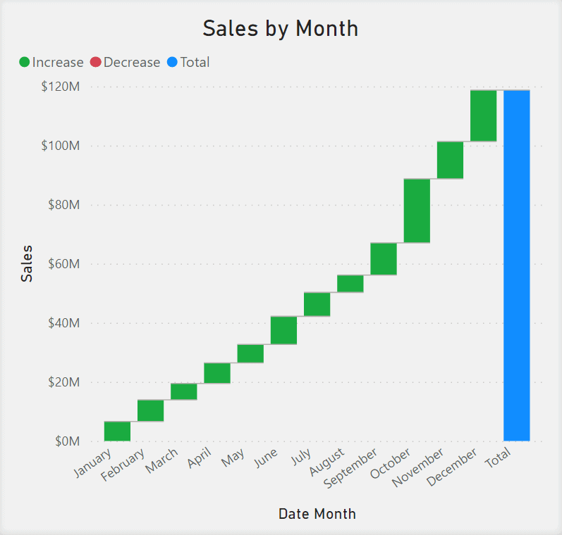
The Waterfall Chart can be used to illustrate changes in Total Sales for a company monthly. The company can use the chart to visualize which months the Total Sales increase or decrease.
Funnel Chart
The Funnel Chart displays a linear process that has sequential connected stages. The chart communicates to the user the health of the process you are tracking. Each stage of the Funnel Chart, illustrated by a rectangle, represents a percentage of the total. Use the funnel chart when your data is sequential through at least 4 stages and if the first stage is expected to be a greater percentage than the final stage. This visual also helps in determining bottlenecks in your workflow.
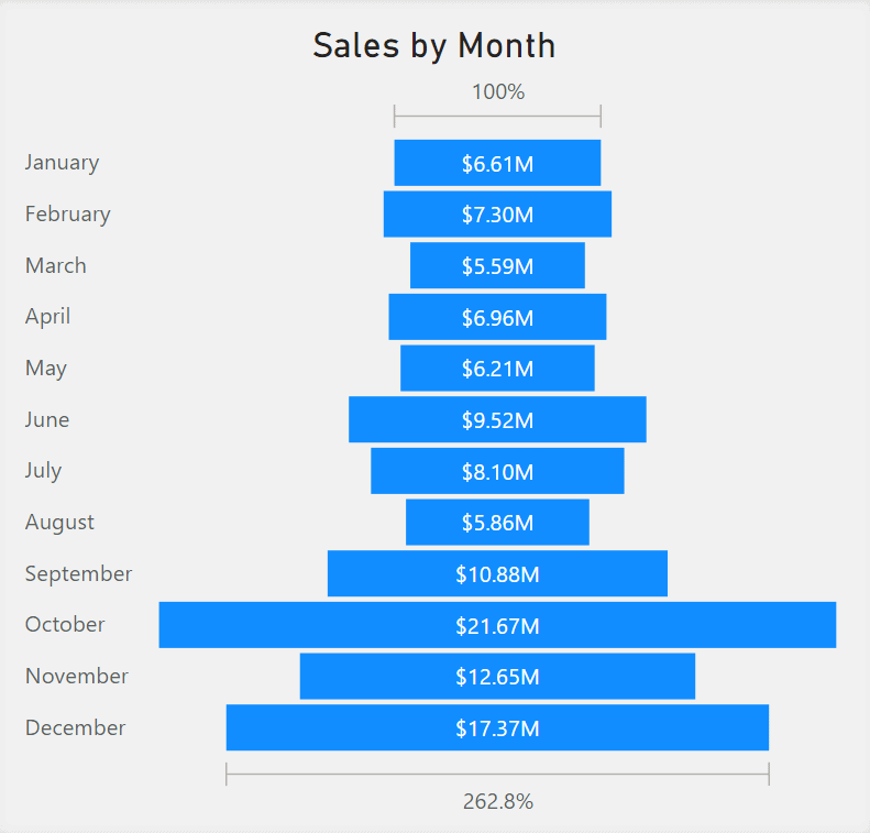
The Funnel Chart can be used to show Total Sales through sequential months. Each month or stage will represent the health of the company’s Total Sales.
Scatter Chart
The Scatter Chart displays the relationship between two numerical values. It combines the intersections of the x- and y-axis into single data points. This chart will display the correlation between two numerical values. If you want to add a third dimension, you can replace the data points with bubbles (circles) where the size of each bubble is represented by the third dimension.

The Scatter Chart can be used to display the relationship between Profit and Discounts for each product sold by a company. This visual can illustrate the effect of implementing a discount on a product and further analyze whether the discount affects Total Profit.
Pie Chart
The Pie Chart displays the relationship of parts to a whole by illustrating numerical proportions represented as slices of a pie. The entire pie represents the whole.
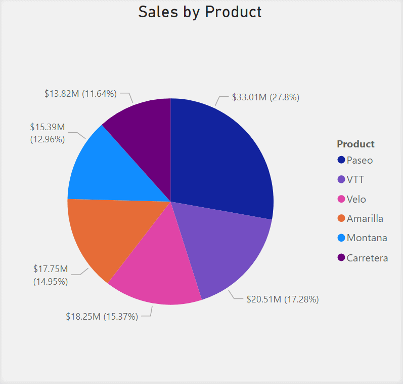
The Pie Chart can be used to display the proportion of Total Sales related to each product. The largest portion of the pie is the product that produces the most sales for the company.
Donut Chart
Similar to the Pie Chart, the Donut Chart displays the relationship of parts to a whole by illustrating numerical proportions represented as slices of a pie. The entire pie represents the whole. Unlike the Pie Chart, the Donut Chart has a circular center that is cut out of the pie, allowing space for a label or icon.
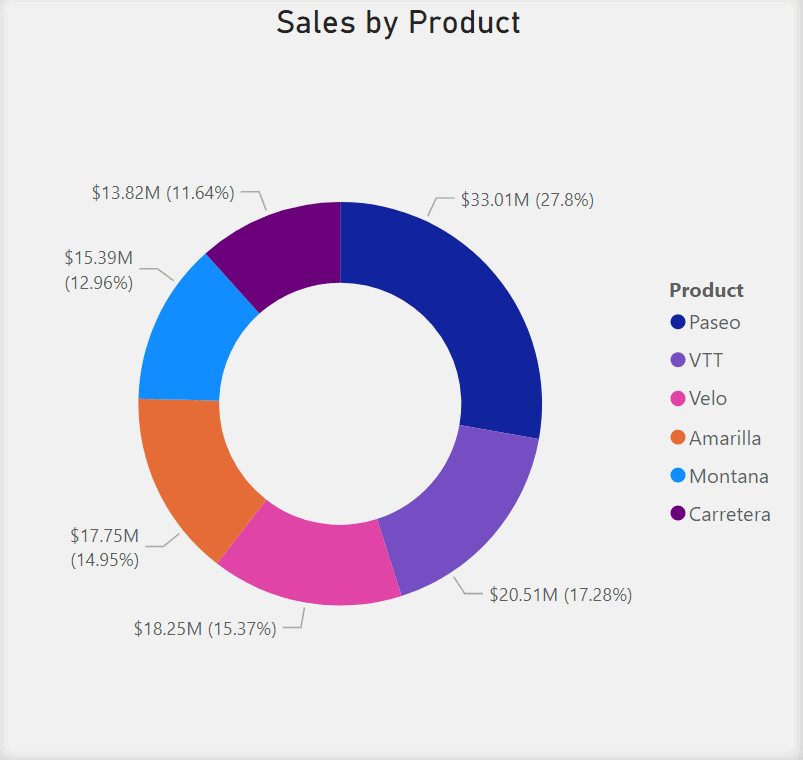
The Donut Chart can be used to display the proportion of Total Sales related to each product. The largest portion of the pie is the product that produces the most sales for the company.
Treemap
The Treemap visual displays hierarchical data as a set of nested rectangles. The levels of the hierarchy are represented by a colored rectangle, also known as the branch. The rectangles within the rectangles further categorize the data and are known as the leaves. The size of each rectangle is determined by a metric and is ordered from largest to smallest. Use a Treemap if you have a lot of hierarchical data to display and to show proportional relationships between each part to a whole.
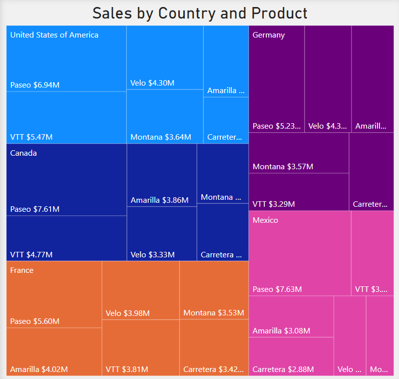
The Treemap visual can be used to display the proportion of Total sales related to each product. The rectangles can represent products, and the size of the rectangle can be represented by the proportion of that product to the Total Sales of the company.
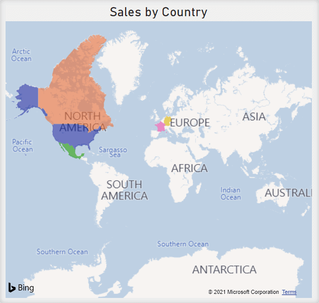
Map
The Map visual maps out data points that have longitude and latitude coordinates as their values. You can include a third dimension to this visual by representing the data points using bubbles (circles), where the size of each bubble is represented by the value of your third dimension.
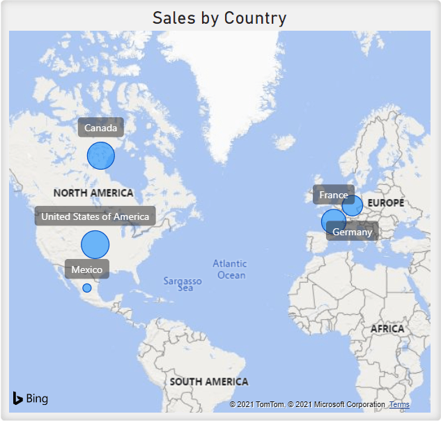
The Map visual can visualize which countries a company makes sales in. The size of the data point could represent the number of sales from that country. This visual quickly indicates which country has the most sales.
Filled Map
The Filled Map visual displays how a value differs in proportion across geography or region by the use of shading, tinting, or patterns.
The Filled Map visual can be used to display the countries a company makes sales in. The geographical regions that produce sales can be shaded in different colors.
ArcGIS Map
Similar to the Map visual, the ArcGIS Map displays data points on a map referencing values that have longitude and latitude coordinates. The ArcGIS Map also has a variety of themes, reference layers, symbol styles, location types, and base maps to choose from. Use the ArcGIS Map to create maps of deeper understanding using the themes.
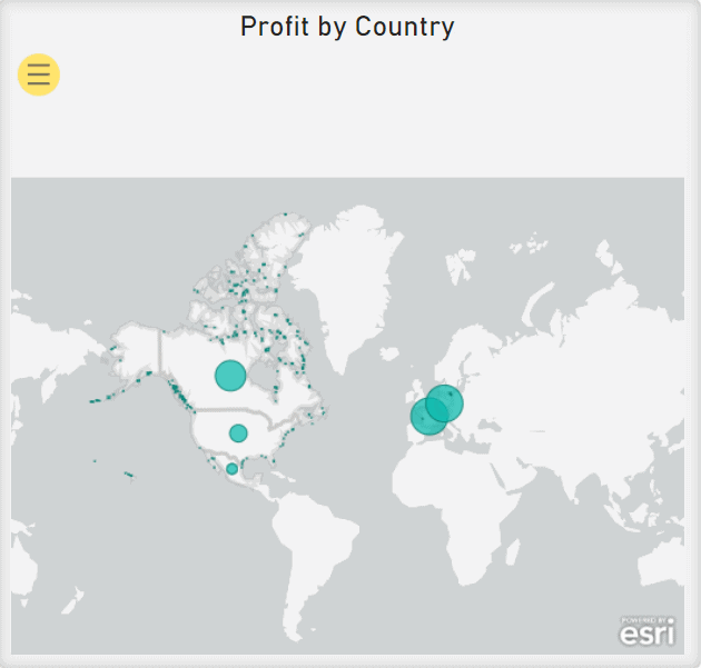
The ArcGIS Map can be used to display Total Sales by Country. The size of each data point represents the proportion of the Total Sales that are made by that region.
Gauge
The Gauge visual displays the minimum, maximum and current value against a goal or Key Performance Indicator (KPI). The line (or needle) on the Gauge visual represents the goal or KPI. The shading of the gauge and the value inside the arc represents the progress value. Use the Gauge visual when you want to measure progress towards a particular goal.
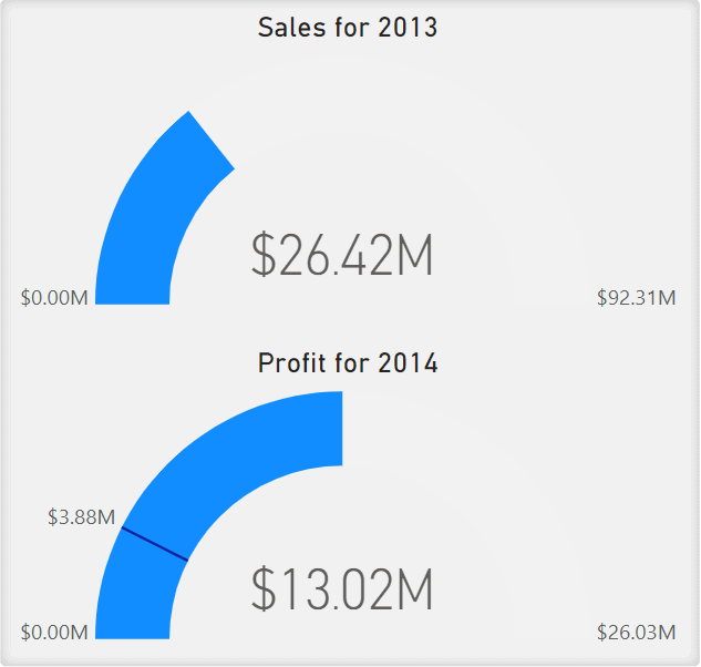
The Gauge visual can be used to display the Total Sales currently, a target sales goal, and the Total Sales from last year. The visual illustrates how far current Total Sales are from a target sales goal.
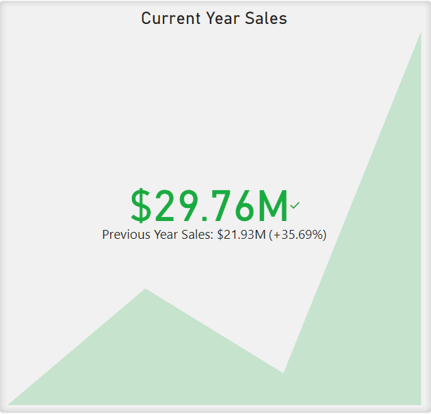
Card
The Card visual is a single value displayed in a rectangular box. Use the card visual when you have a critical value that is important to communicate to your audience.
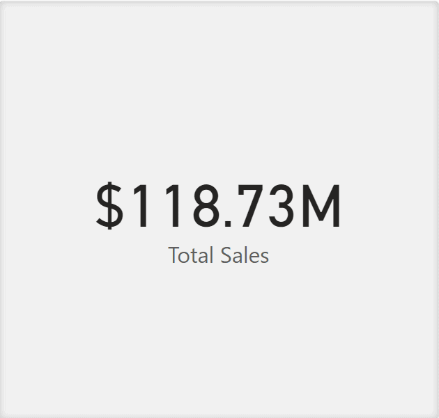
The Card visual can display important values for business decisions such as Total Sales, Total Sales for the previous year, or Profit.
Multi-Row Card
Similar to the Card visual, the Multi-Row Card visual is used to display single values but in a group format or a section. Use this visual if you have multiple single values that you want to present in your report.
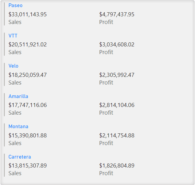
The Multi-Row Card can be used to display a series of values showing Sales and Profit, grouping them by Product.
Key Performance Indicator (KPI)
The KPI visual is a visual cue that communicates the progress made towards a measurable goal. It contains the goal and the current progress as single values. You can also add a trend axis to the visual that displays an Area Chart behind the values to represent the trend of progress over time.
The KPI visual can be used to measure progress toward a sales goal. The KPI visual can display Total Sales, Total Sales of the previous year, and a trend line to show the progression over time.
Slicer
The Slicer can filter your data. You can select how you want to filter the dataset directly from the report canvas. The Slicer will affect the other visuals on the report based on the chosen filter. Use the Slicer to create more focused reports by displaying common or important filters.
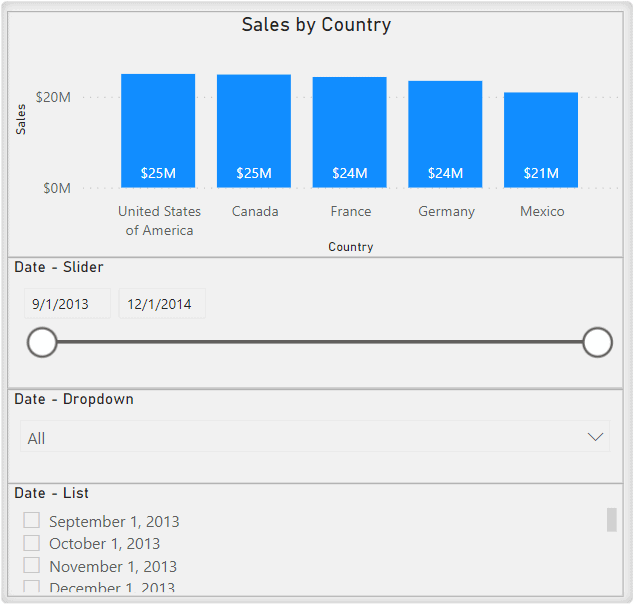
The Slicer can be used to display a Country Name slicer that drills down the visuals in the report to the selected country or countries.
Table
The Table visual is in a basic 2-dimensional structure that represents tabular data in a grid-like format. It is a flat structure representation of the data.
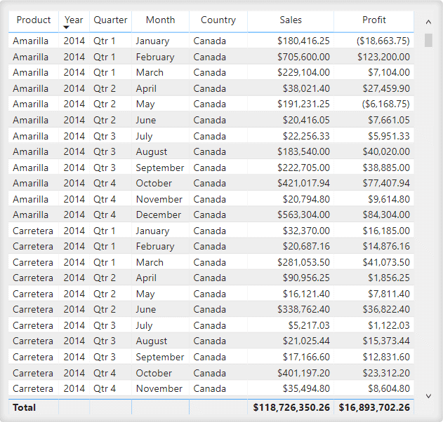
The Table visual can be used to display a more detailed view of transactions within a company.
Matrix
Similar to a Table, the Matrix represents tabular data in a grid-like format. It also automatically aggregates the data and enables you to drill down. The Matrix displays data meaningfully across multiple dimensions. To gain insights quicker, you can also apply conditional formatting.
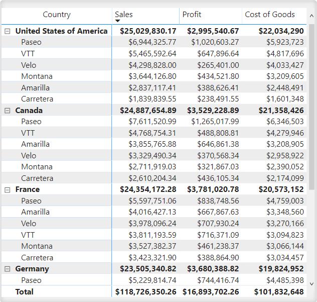
The Matrix visual can be used to display a more detailed view of Sales, Profit, and Cost of Goods for each product, grouped by Country.
R Script Visual
The R Script Visual uses an R script. It allows you to prepare, analyze, and plot visuals by running R scripts on your dataset directly on the Power BI desktop. However, you can only run R scripts if you have downloaded R to your local computer.
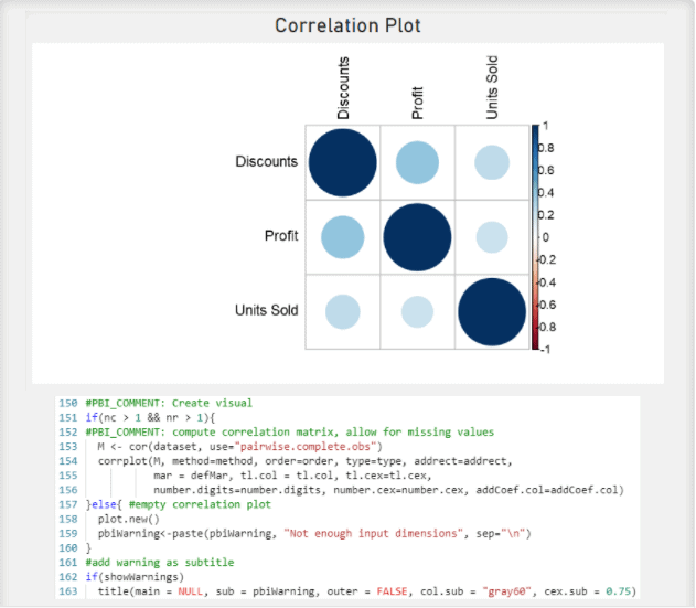
The R Script Visuals can be used to go beyond the out-of-the-box visuals in Power BI. Create visuals such as correlation plots, violin graphs, and heatmaps.
Python Visual
The Python Visual uses the Python programming language. It allows you to prepare, analyze, and plot visuals by running Python scripts on your dataset directly on the Power BI desktop. However, you can only run Python scripts if you have downloaded Python to your local computer.
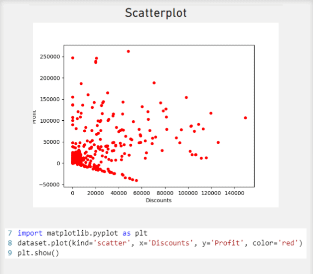
The Python Visuals can be used to go beyond the out-of-the-box visuals in Power BI. Create visuals such as pair plots, scatterplots, and circular bar graphs.
Key Influencers
The Key Influencers visual analyzes the data and ranks in order of factors that matter. Therefore, the factors with the highest correlation are displayed first. Use this visual to understand what factors affect the metric being analyzed or when you want to contrast the relative importance of the factors.
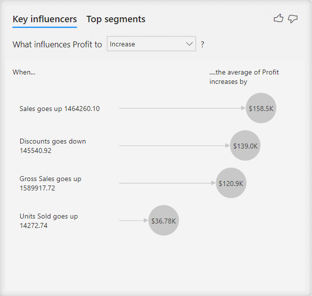
The Key Influencers visual can be used to determine what influences Profit to increase for a company. The visual indicates that the more Sales increase, the more Profit increases, and the more Discounts decrease, the more Profit increases.
Decomposition Tree
The Decomposition Tree visual displays data across multiple dimensions by aggregating the data for you, enabling you to drill down in any order. It uses artificial intelligence (AI) to find the next dimension to drill down. Use the Decomposition Tree when you want to conduct root cause analysis or ad-hoc exploration.
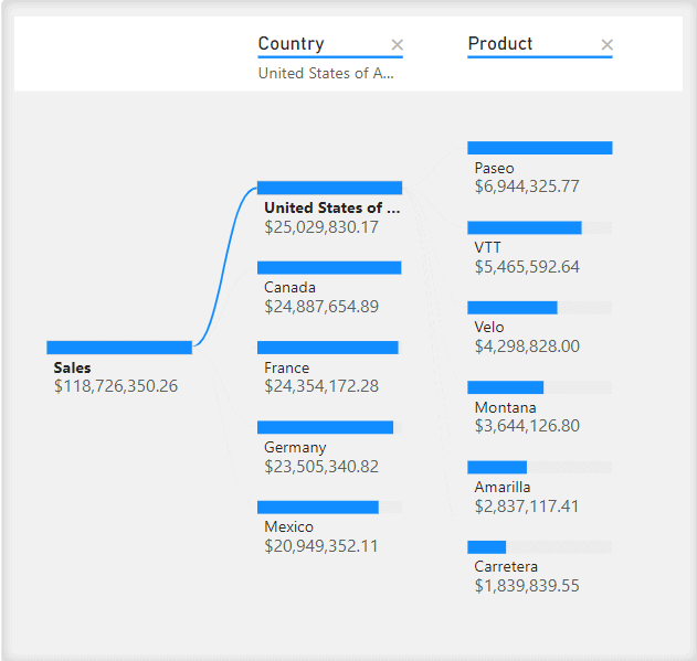
The Decomposition Tree visual can be used to illustrate Sales being displayed across the dimensions of Country and Product.
Q&A
The Q&A feature allows you to type a question in the report using natural language and receive an answer as a visual. The Q&A engine uses artificial intelligence (AI) to decide which visual to use based on the words in the question.
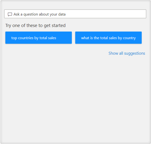
Use the Q&A feature to type questions in natural language, such as “What is the top Country by Total Sales?” or “What Product has the most Sales?”
Custom Visuals
The “Get more visuals” feature takes you to a Power BI visual store where you can add custom visuals made by other developers or from your organization. You can add the custom visuals to the selection of visuals already in the Power BI service.
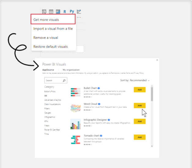
The “Get more visuals” feature allows you to add custom visuals such as Word Cloud, Tornado charts, Radar charts, or Road maps to your dashboard.
About the Dashboard Creators

Diana Arciniega is an Analytics Consultant at Iteration Insights, a tech-enabled, data analytics solutions provider located in Calgary, Alberta.
Diana has a Bachelor’s of Science from the University of Calgary, Majoring in Actuarial Science and Minoring in Statistics. In June Diana will graduate with a certificate in Business Intelligence and Data Analytics from SAIT. She is currently working towards a Microsoft Certified Data Analyst Associate Certification.
She is very passionate about Storytelling with data, and empowering others throughout their data-driven journey. In her spare time she loves reading fantasy and science fiction and playing board games with friends.

Eric Kolesar is an Analytics Consultant at Iteration Insights, a tech-enabled, data analytics solutions provider located in Calgary, Alberta.
He graduated from the University of Calgary with a degree in Economics and a minor in Computer Science. He will also soon be completing his Business Intelligence Data Analysis and Reporting certification from the Southern Alberta Institute of Technology. Along with those he is currently Microsoft Certified in Azure Data Fundamentals and is working towards a Microsoft Data Analyst Associate Certification.
Outside of work you can find Eric watching hockey, playing video games, or following anything tech-related. Recently he has also been getting back into golf.
If you want to feel more confident in creating your own projects in Power BI, learn Power BI skills here to get you started.
