
“The best way to predict the future is to study the past, or prognosticate.”
– Robert Kiyosaki
Machine learning can do all sorts of wonderful things. It can open up insights into your data, predict the future, and provide direction to your decision-making. An important part of all of this, beyond the technologies used, or the types of models you create, is the validation of those models. In-accurate machine learning won’t help you at all and could cost your organization money.
There are many ways to validate and display the accuracy of a machine learning model. Both R and Python have support for these that can be implemented in Power BI. However, in this blog, I would like to do the validation using only standard Power BI visuals and DAX.
This type of analysis can be done in Power BI either as a one-time validation or as an ongoing program to monitor a model’s effectiveness. What follows are several ways to validate machine learning models in Power BI.
Sections
Our Power BI Data
import numpy as np
import pandas as pd

from sklearn import svm, datasets
from sklearn.model_selection import train_test_split
from sklearn.preprocessing import label_binarize
from sklearn.multiclass import OneVsRestClassifier

# Import some data to play with
bc_data = datasets.load_breast_cancer()
X = bc_data.data
y = bc_data.target

# Binarize the output
y = label_binarize(y, classes=[0, 1])
n_classes = y.shape[1]

# Add noisy features to make the problem harder
random_state = np.random.RandomState(0)
n_samples, n_features = X.shape
X = np.c_[X, random_state.randn(n_samples, 200 * n_features)]

# shuffle and split training and test sets
X_train, X_test, y_train, y_test = train_test_split(X, y, test_size=0.5, random_state=0)

# Learn to predict each class against the other
classifier = OneVsRestClassifier(
    svm.SVC(kernel="linear", probability=True, random_state=random_state)
)
y_score = classifier.fit(X_train, y_train).decision_function(X_test)

# DataFrame
results = pd.DataFrame(zip(y_score, y_test), columns=['Prediction', 'Result'])
The main columns of the data I will be looking at are the ‘Prediction’ column which gives the output of the model as a decimal number and the ‘Results’ column which is either a 1 or a 0.
This is an example of a binary classification where there are only two possible outcomes. I will be using the term ‘event’ in the case of a 1, and non-event in the case of a zero. If all went well, higher Prediction values should correlate with events, and the higher the prediction value the more the model believes the result to be an event.
Often, a threshold value is used to determine the outcome of the prediction. Predicted values above the threshold are a positive prediction predicting the event will happen. Values below the threshold are a negative prediction, predicting the event will not happen.
When doing this sort of validation in reality you do need both the prediction and an actual result. This could come from a part of your training data held back as a test set or waiting for results to come in from whatever you are predicting.
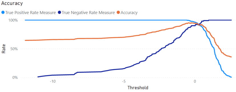
Accuracy Plot Validation
The simplest way to validate your model is to plot the accuracy of the predictions. In an accuracy plot, prediction/threshold values form the X-axis with the percentage correct plotted on the Y-axis.
There are two ways a prediction could be correct in binary classification. – A True Positive, where the prediction says an event will happen, and the event happens. – A True Negative is when the model says an event will not happen, and the event does not happen.
Below are measured for calculating the True Positive Rate, True Negative Rate, and Accuracy Rate for the visual.
True Positive Rate Measure =
VAR threshold = SELECTEDVALUE ( 'Results'[Prediction] )
VAR truePos =
CALCULATE (
    COUNTROWS ( 'Results' ),
    'Results'[Prediction] >= threshold,
    'Results'[Result] = 1
)
VAR allEvent =
CALCULATE (
    COUNTROWS ( 'Results' ),
    ALL ( 'Results' ),
    'Results'[Result] = 1
)
RETURN
DIVIDE ( truePos, allEvent )
True Negative Rate Measure =
VAR threshold = SELECTEDVALUE ( 'Results'[Prediction] )
VAR trueNeg =
CALCULATE (
    COUNTROWS ( 'Results' ),
    'Results'[Prediction] < threshold,
    'Results'[Result] = 0
)
VAR allNoEvent =
CALCULATE (
    COUNTROWS ( 'Results' ),
    ALL ( 'Results' ),
    'Results'[Result] = 0
)
RETURN
DIVIDE ( trueNeg, allNoEvent )
Accuracy Rate =
VAR threshold = SELECTEDVALUE ( 'Results'[Prediction] )
VAR truePos =
CALCULATE (
    COUNTROWS ( 'Results' ),
    'Results'[Prediction] >= threshold,
    'Results'[Result] = 1
)
VAR trueNeg =
CALCULATE (
    COUNTROWS ( 'Results' ),
    'Results'[Prediction] < threshold,
    'Results'[Result] = 0
)
VAR allRows =
CALCULATE (
    COUNTROWS ( 'Results' ),
    ALL ( 'Results' )
)
RETURN
DIVIDE ( truePos + trueNeg, allRows )
Below is the model validation chart using these measures. You can see, as the Threshold increases from left to right on the X-axis, the True Positive Rate goes down and the True Negative Rate goes up. Accounting for both of them, the Accuracy peaks at about 95% with a Threshold of -0.23.
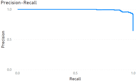
ROC Curve and Precision-Recall Validation
Two other graphs commonly used in machine learning are the ROC Curve and Precision-Recall plots. Both of these graphs show the effect of changing the threshold value and the accuracy of the predictions. Each point on the graph represents a possible threshold value, with its position on the graph indicating how good it is.
The ROC curve (Receiver Operating Characteristic) comes from World War 2 where it was developed to evaluate Radar Receiver Operators. It plots the False Positive Rate against the True Positive Rate for a range of threshold values. This graph is good at showing how effective a model is when the number of events/non-events is roughly equal.
In the case when the number of events is low, such as credit card fraud, use the Precision-Recall curve. Here, the Recall (the same as the True Positive Rate) is plotted against Precision, which is the number of True Positives divided by the total number of positive predictions.
To make these plots, the first step is to create a calculated table. Below is the DAX code necessary to create this table.
Predictions =
ADDCOLUMNS (
    CALCULATETABLE ( DISTINCT ( 'Results'[Prediction] ) ),

    "False Positive Rate",
    VAR threshold = [Prediction]
    VAR falsePositives =
        CALCULATE (
            COUNTROWS ( 'Results' ),
            'Results'[Prediction] >= threshold,
            'Results'[Result] = 0
        )
        VAR trueNegatives =
        CALCULATE (
            COUNTROWS ( 'Results' ),
            'Results'[Prediction] < threshold,
            'Results'[Result] = 0
        )
        RETURN
        DIVIDE ( falsePositives, falsePositives + trueNegatives ) + DIVIDE ( threshold, 10000000 ),

    "True Positive Rate/Recall",
    VAR threshold = [Prediction]
    VAR falseNegatives =
        CALCULATE (
            COUNTROWS ( 'Results' ),
            'Results'[Prediction] < threshold,
            'Results'[Result] = 1
        )
        VAR truePositives =
        CALCULATE (
            COUNTROWS ( 'Results' ),
            'Results'[Prediction] >= threshold,
            'Results'[Result] = 1
        )
        VAR positives =
        CALCULATE (
            COUNTROWS ( 'Results' ),
            'Results'[Result] = 1
        )
        RETURN
        DIVIDE ( truePositives, truePositives + falseNegatives ) + DIVIDE ( threshold, 10000000 ),

    "Precision",
    VAR threshold = [Prediction]
    VAR falsePositives =
        CALCULATE (
            COUNTROWS ( 'Results' ),
            'Results'[Prediction] >= threshold,
            'Results'[Result] = 0
        )
        VAR truePositives =
        CALCULATE (
            COUNTROWS ( 'Results' ),
            'Results'[Prediction] >= threshold,
            'Results'[Result] = 1
        )
        RETURN
        DIVIDE ( truePositives, truePositives + falsePositives )
)
The code begins by collecting all of the prediction values from the model into one column. Based on this column, several more are calculated: False Positive Rate, True Positive Rate/Recall, and Precision.
The results for the True and False Positive Rate columns have an extra term added to them in the form of DIVIDE ( threshold, 10000000 ). These columns, are sorted by the Prediction column and the extra term ensures all the values are unique so sorting works and Power BI does not give an error while not altering the values much.
To create the ROC curve, create a line chart. Then add the False Positive Rate as the Axis value and True Positive Rate as the Values.
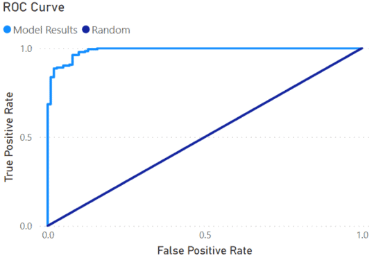
I added a Neutral or Random line by creating the measure below.
Neutral =
SELECTEDVALUE ( 'Predictions'[False Positive Rate] )
This measure will create the diagonal line in the chart running from 0,0 to 1,1. The line represents the accuracy of randomly guessing the outcomes. The degree the results are above the line shows how accurate the model is. A perfect model would go straight up the Y-Axis, make a 90-degree turn at 1, then straight across the top.
Similar to the ROC curve, the Precision-Recall curve is another Line Chart. This time, I used the True Positive Rate/Recall as the Axis value and Precision as the Y-axis. The graph shows up opposite compared to the ROC curve. A perfect model here would go straight across the top from left to right, then straight down the right side.
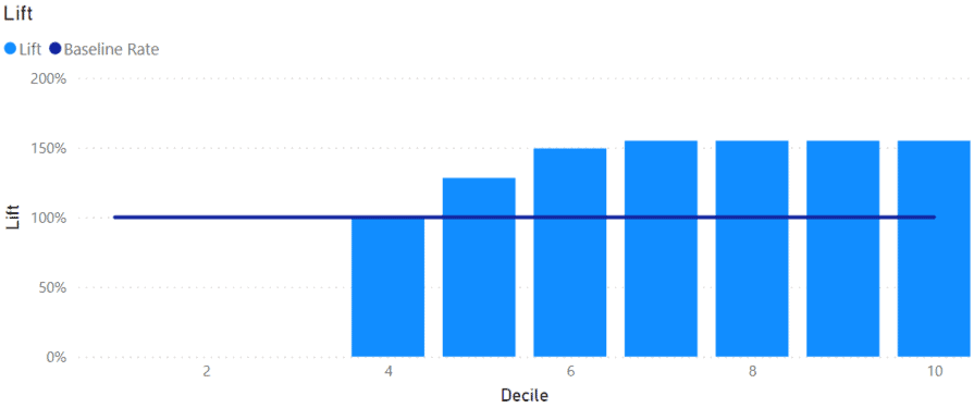
Lift Model Validation
In situations, such as marketing, finding the optimum group of potential customers to market to is important. A business may have a large list of potential customers, but a marketing campaign will only convert a small number of those individuals into customers. It makes sense to target individuals who have a high probability of converting and avoid spending resources on those who are least likely to.
We can group customers, or any data, by the probability values generated by our Power BI model. For each group, we can calculate the Lift, the rate each group over or under-represents the average conversion rate.
Typically, the prediction values are used to divide up the rows into deciles. This can be done as a calculated column on the ‘Results’ table in Power BI using the DAX below.
Decile =
VAR val = 'Results'[Prediction]
VAR rankNum = RANK.EQ ( val, 'Results'[Prediction], ASC )
VAR maxRank =
MAXX (
    'Results',
    RANK.EQ ( 'Results'[Prediction], 'Results'[Prediction] )
)
RETURN
CEILING ( DIVIDE ( rankNum, maxRank ) * 10, 1 )
This column puts the rows with the highest prediction scores into the 10th decile, while those with the lowest in the 1st decile. The following measures are used to determine the lift for each decile, dividing the accuracy rate for a given decile by the rate for the entire dataset.

Predicted Rate =
VAR decile = SELECTEDVALUE ( 'Results'[Decile] )
VAR total =
CALCULATE (
    COUNTROWS ( 'Results' ),
    'Results'[Decile] = decile
)
VAR correct =
CALCULATE (
    COUNTROWS ( 'Results' ),
    'Results'[Decile] = decile,
    'Results'[Result] = 1
)
RETURN
DIVIDE ( correct, total )
Average Rate =
VAR total =
CALCULATE (
    COUNTROWS ( 'Results' ),
    ALL ( 'Results' )
)
VAR positives =
CALCULATE (
    COUNTROWS ( 'Results' ),
    ALL ( 'Results' ),
    'Results'[Result] = 1
)
RETURN
DIVIDE ( positives, total )
Lift =
DIVIDE ( [Predicted Rate], [Average Rate] )
The lift can then be plotted on a Column chart. I added a line at 100% to show the baseline. Any columns extending above the baseline show deciles with above-average accuracy or Lift.
If these were potential customers, it would make sense to spend most of the marketing resources on the 6th to the 10th decile because those have a higher propensity to convert. Customers in the 1st to 3rd decile could be ignored.
Conclusion
In this blog, I’ve shown several ways you can validate and monitor your machine learning models in Power BI. When using machine learning models, it is important to know how well they are doing and if they are reliable. Using the visuals in this blog, you should be able to keep an eye on your models and either have confidence in your results or know you need to update them.
