
Sections
Introduction
Once we have the necessary information included in a project we are working on, how do we know when the design is done?
Well, a design may never feel done. Accepting that design is subjective and that the standards for design are always evolving, it’s quite difficult to have a design that will never need to be updated.
Especially when talking about design and technology.
An iterative design process allows us to work through design phases internally so we can put out the most complete design possible at the time, while also acknowledging that there will be ways to adjust and improve in the future.
In this blog, we explore our design process for our latest internal project: The Complete Interactive Power BI Visualization Guide.
We want to examine our design process for ourselves and others by creating this blog to look back on so we can continue to evolve our process and find new ways to improve in the future.
The Design of the Interactive Power BI Visualization Guide
The Interactive Power BI Visualization Guide project began with the idea of creating a visualization guide for company use while teaching Power BI.
The focus with this project being that the resource be built in Power BI to showcase the visualizations interactively rather than just in static images.
It was quickly decided that this project could be more than just an internal company resource. We figured since we felt the need for such a resource, others must too.
Based on this desire to create something others could use; we had a list of things we wanted to achieve with the project:
- Create an easy-to-understand resource for beginners learning and using the out-of-box visuals in Power BI.
- Create a reference for Power BI developers to help them recall information and determine which visualization is most suited to their data.
- Develop a template for the interactive dashboard such that it can be easily updated in the future when new visuals are introduced to the list.
- Create usable and accessible dashboard content.
Creating an Easy-to-Understand Resource for Beginners
When researching other Power BI resources online, we found many required the user to already be experienced in Power BI or that the resources were talking about visualizations as a general concept.
We wanted to create a simple resource that’s about the basics and is specific to Power BI.
To begin, we had to get all the definitions in one place. We found that writing over 30 definitions began to feel repetitive, so we initially tried to get creative with the wording from one definition to the next.
However, we had to take a step back and understand that users of our visualization guide are likely not reading the content one definition after the other.
We realized we didn’t need to get creative with the wording, we needed consistency and structure so all the definitions would make sense from one visualization to the next.
Throughout the guide, we also refer to other visualizations within definitions, highlighting the similarities between certain visualization types.
While it is easy to simply draw the readers’ attention to the similarities, we realized we needed to also define the similarity again, even though a user could jump to the referenced definition to understand the similarity.
Although the repetition throughout definitions could feel dry when writing all definitions at once, we wanted to ensure a user could land on any definition page and have the information they need right in one spot.
We didn’t want the user to have to jump around between the pages to understand one visualization.
To create an easy-to-understand resource for beginners, we had to lean into the repetition within the guide definitions because many of the visualizations are quite similar.
We also had to make sure we weren’t assuming the user has a lot of knowledge of visualizations when first interacting with our guide.
Our definitions and use cases aim to provide all the knowledge someone would need, at a beginner level or higher, to understand how to use each visualization.
Creating a Reference for Power BI Developers
While we wanted the design to be a resource for beginners to learn about the visualizations in Power BI, we also wanted it to be useful to developers actively working in Power BI.
The straightforward definitions and use cases help in both cases as a straightforward “cheat sheet” of visualization descriptions.
When looking at how a developer could use the guide, it caused us to really focus on the navigation of the dashboard as well.
A beginner may casually explore the dashboard to get an understanding of all the visualizations. Or they may just go in looking for the definition they need, find it in the menu, and have all the information there on the one page.
When testing the dashboard internally with experienced Power BI developers, we noticed the desire to jump around quickly between pages they knew they were looking for based on their current task as they wanted to compare visualizations quickly.
For example, we started this project as a resource to use while teaching Power BI. Thinking through how a teacher would use the dashboard, we found they needed to navigate quickly to be able to talk about multiple visualizations in a short time frame.
They were expecting to be able to go at a similar pace to when they click through slides in a presentation.
Improving the navigation required focusing on the usability of the dashboard for our users. This process is described in-depth in Our Usability Considerations.
Developing a Template for the Complete Interactive Power BI Visualization Guide
We made the guide satisfy our project goals such that it is as complete as possible right now, while acknowledging that there will be Power BI updates.
To continue to keep the guide useful as a complete resource, we needed to ensure the dashboard could be updated relatively easily in the future.
The dashboard was created using a factless fact table for storing the names, categories, definitions, and use cases of the different visualizations.
All this information is stored in the Excel file data source.
The actual visualizations on each page are added manually and use a sample financial dataset available to anyone using Power BI Desktop.
Future updates will require updating the Excel file data source and manually adding the visualizations to the newly created pages. The pages also all look the same by using a static background image.
Creating a Usable and Accessible Dashboard
We have discussed a lot of design considerations we made based on understanding the purpose of our dashboard, the needs of our users, and doing some internal testing.
How do these considerations all come together to create a usable and accessible dashboard?
First, let’s look at the definition of usability in terms of technology.
Usability is a quality attribute that assesses how easy user interfaces are to use. The word “usability” also refers to methods for improving ease-of-use during the design process.
Jakob Nielson
Jakob Nielson also describes other important attributes such as utility that are key when creating a usable design:
- Definition of Utility = whether it provides the features you need.
- Definition of Usability = how easy & pleasant these features are to use.
- Definition of Useful = usability + utility.
Now, let’s look at a definition of accessibility in relation to the web.
Web accessibility means that websites, tools, and technologies are designed and developed so that people with disabilities can use them.
W3C WAI
Usability and accessibility can and should apply to everything we interact with throughout our daily lives.
With these definitions in terms of technology, we can understand how usability and accessibility work together to create good design and appreciate how their different components need to be considered.
Ultimately, usability is about creating a good experience for anyone interacting with the product. Accessibility is about ensuring there are no barriers in place that would limit people from being able to interact with the product.
While accessibility is primarily considered for people with disabilities, the effect of accessible designs helps everyone.
In the following subsections, we examine some specific usability and accessibility considerations made during this project.
By examining our design choices in-depth, we hope to improve our design process for the future so we can not only appreciate why we made the design decisions we did but also understand why they worked.
Our Usability Considerations
Initial conversations about what was needed for this project mainly revolved around usability. We focused on having a Power BI specific layout, easy-to-understand information, and improved navigation.
Power BI Specific Layout
Looking at Jakob’s Law, we know that users have a better experience on the web when the new product they are interacting with mimics designs they have interacted with before.
Leveraging existing mental models allows a user to have a base level of understanding when using a new product if it mimics a similar product.
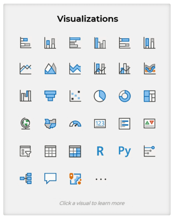
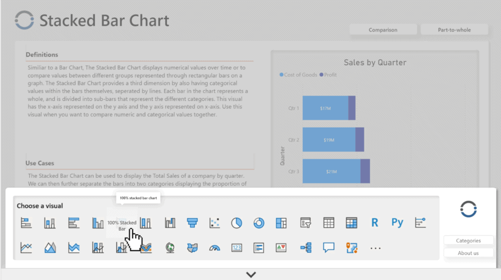
Although our product is not actually similar to Power BI in how it functions as software, it is specific to Power BI, which is why we used the software to create the dashboard and used the Power BI icons for the navigation menu.
We wanted to leverage any existing Power BI knowledge our users may have when using our guide.
The icons in the navigation menus match the icons used in Power BI, the names of the visualizations match, and the order of the visualizations match.
This mimicry of Power BI should lend itself to people with any experience in Power BI to be able to understand our guide that much quicker.
Also, the navigation on the homepage is similar to the layout of icons in Power BI which may feel more usable to users.
The pop-up menu of icons is at the bottom of the screen once the user enters the dashboard and in a different layout to have more room to use for the icons which helps satisfy Fitts’s Law that states touch targets should be large enough for a user to accurately hit them.
If people get “lost” in our dashboard, they can also use the logo in the top left of the page to return to the home screen.
Although all navigation can be done with the pop-up menu once someone enters the dashboard, we found people can want to “reset” when interacting with something new.
This use of our logo also applies Jakob’s Law by mimicking how websites allow users to return to a homepage.
Easy-to-Understand Information
Since we knew our resource was being designed for a beginner level understanding or higher of Power BI, and that it could be used as a “cheat sheet” for developers when working in Power BI, creating a good user experience required easy-to-understand information.
Considering the Serial Position Effect, we know that our desired user experience of users accessing easy-to-understand information will occur when the information presented to them is in a simple layout that does not overwhelm them with information all at once.
We aimed to achieve this by making each visualization page work as a stand-alone document that does not require a user to jump around to other pages to get a full understanding of a visualization.
While the visualizations themselves can get complex, the ability to drill down using Power BI, rather than being shown a series of images describing the visual, allows the information to be broken up into smaller pieces and explored at the users own pace.
Being able to hide the pop-up navigation menu also helps limit the amount of information on the page at one time.
The user will simply access the menu when needed rather than feeling distracted by all the icons while trying to focus on the current visualization page.
Improved Navigation
The Doherty Threshold tells us that a user will have a better user experience when interacting with a system if they get system feedback in less than 400ms.
When testing a previous iteration of our dashboard internally, we found that users may get frustrated when navigating through the dashboard when the navigation menu just used icons.
We tried adding visualization names as tooltips but the wait time needed to get the tooltip to appear was too long and inconvenient.
Using the button trigger “on hover” in Power BI, we were able to have hidden names of the visuals that appear immediately when hovered over. The default button text is set to no text.
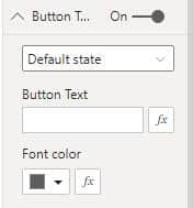
On hover, the text is set to the name of the visualization.
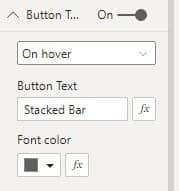
There is also a fill color that allows the icon to be mostly hidden on hover so the text that appears can be read. The icon is a static image, so a white fill color is applied.
The default is 100% transparency which allows us to see through the white fill layer to the icon below such that the icon is fully opaque.
On hover, the white fill becomes 10% transparent which is almost opaque.
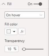
This causes the icon below to appear transparent because it is being almost fully obscured by the white fill overlaid on the icon.
The tooltip is still included but having the “on hover” text appear instantaneously gives system feedback even when a user passes their cursor over a series of icons quickly.
This instant feedback helps with navigation and helps the user understand that the icons are clickable.
Our Accessibility Considerations
For accessibility, we wanted to create a readable design, have simple interactions, and offer multiple ways to access the information.
Improving Readability
Using tools like a contrast checker, we can ensure the colours used are clear and readable. We also made the font size as big as possible, within the limitation that all the pages are the same and therefore have the same text parameters.
Prioritizing a simple layout also allows us to have a lot of white space within the design to help with the flow of information. White space allows the reader’s eye to be guided around the page without being overwhelmed by information.
Creating Simple Interactions
While creating simple interactions is closely tied to improved navigation, it is still key to think about in terms of both usability and accessibility.
For example, the pop-up menu was placed at the bottom of the dashboard to give more space for creating bigger icons.
While this layout helps satisfy Fitts’s Law that touch targets should be large enough for a user to accurately hit them therefore improving usability of the dashboard, it is also about accessibility.
By having larger icons that are at the bottom of the screen, the aim is to reduce complex mouse movements.
The buttons are close together because navigation may require jumping around to multiple pages while giving a large bounding box to each icon that allows the user to not have to perfectly hit the icon when interacting with the menu.
The instant system feedback of the hover effect causing the titles to appear even if the cursor quickly rolls over all icons also helps.
It minimizes the complexity of mouse movements since a user does not have to constantly move and stop the mouse to get the information they need of the titles of each icon.
In earlier design iterations, we had more button options in the top right corner of each page.
We tried to offer a lot more information about the groupings of visualizations but realized it was confusing on the page and didn’t offer much value.
To improve navigation, we wanted to ensure we limited the use of buttons so the user could easily understand how to navigate through the dashboard.
By limiting the number of buttons in the top right of the page, it gave us more space to create bigger buttons there as well.
Offering Multiple Ways to Access the Information
Although an interactive dashboard makes sense for displaying information about Power BI in an engaging format, it may not be the most accessible format.
Accessibility considerations led us to the creation of the blog post on our website that is specific to the dashboard.
The information in the blog post is simply a textual page with HTML headers such that the dashboard information can be accessed with tools like screen readers.
We also added static images of the visualizations that include alt text.
The alt text focuses on describing the layout of information to demonstrate how the different types of visualizations can be used as that is the purpose of the visualizations in the dashboard.
Conclusion
Usability and accessibility considerations can always be improved. We hope our guide is helpful to the people already using it and we welcome any feedback as to how to make it better for people in the future.
Our goal is to continue to update the guide as needed based on feedback from our community and the addition of new features within Power BI. We want to ensure the guide remains as complete as possible alongside the technology it describes.
About the Dashboard Creators

Diana Arciniega is an Analytics Consultant at Iteration Insights, a tech-enabled, data analytics solutions provider located in Calgary, Alberta.
Diana has a Bachelor’s of Science from the University of Calgary, Majoring in Actuarial Science and Minoring in Statistics. In June Diana will graduate with a certificate in Business Intelligence and Data Analytics from SAIT. She is currently working towards a Microsoft Certified Data Analyst Associate Certification.
She is very passionate about Storytelling with data, and empowering others throughout their data-driven journey. In her spare time she loves reading fantasy and science fiction and playing board games with friends.

Eric Kolesar is an Analytics Consultant at Iteration Insights, a tech-enabled, data analytics solutions provider located in Calgary, Alberta.
He graduated from the University of Calgary with a degree in Economics and a minor in Computer Science. He will also soon be completing his Business Intelligence Data Analysis and Reporting certification from the Southern Alberta Institute of Technology. Along with those he is currently Microsoft Certified in Azure Data Fundamentals and is working towards a Microsoft Data Analyst Associate Certification.
Outside of work you can find Eric watching hockey, playing video games, or following anything tech-related. Recently he has also been getting back into golf.
